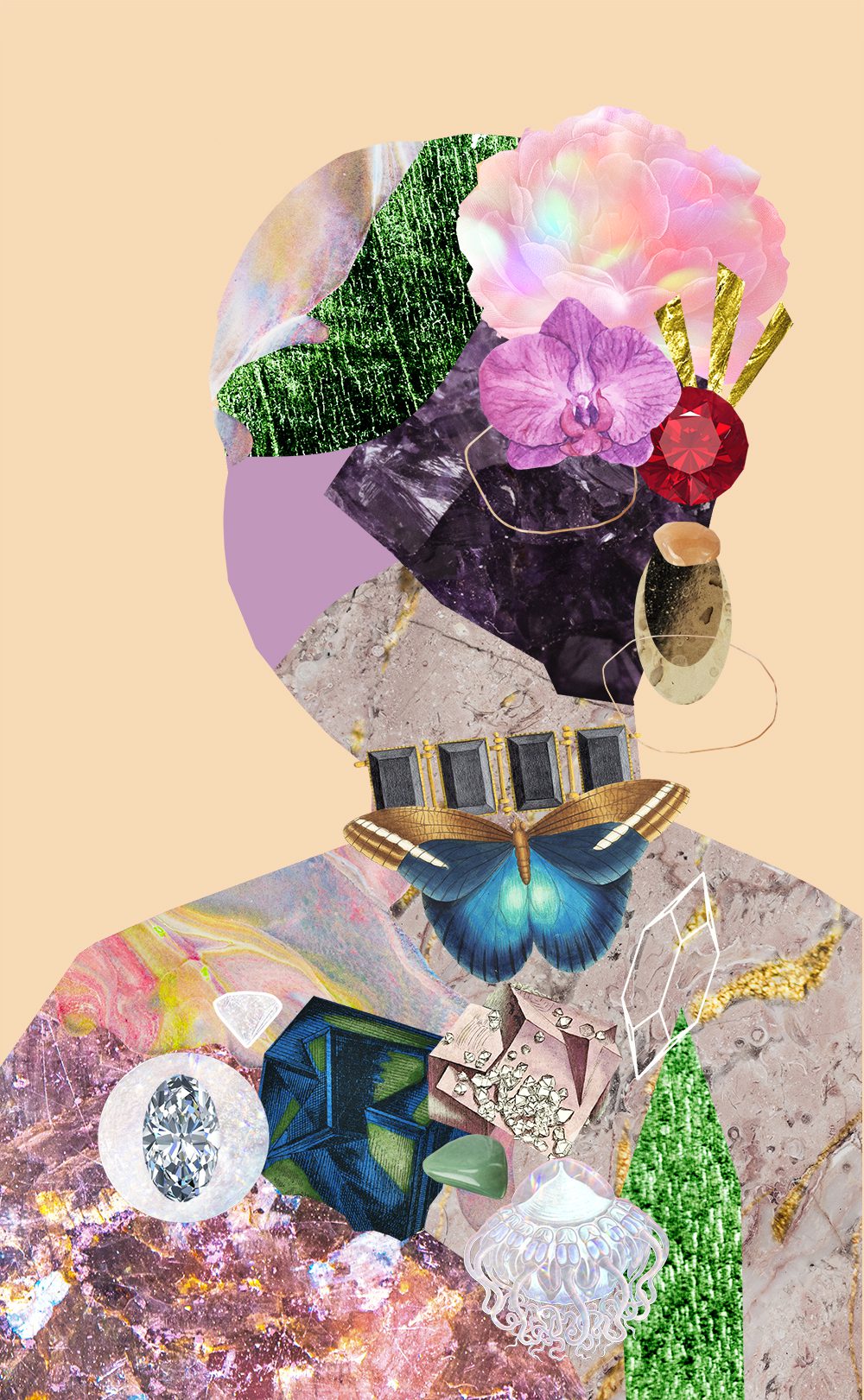
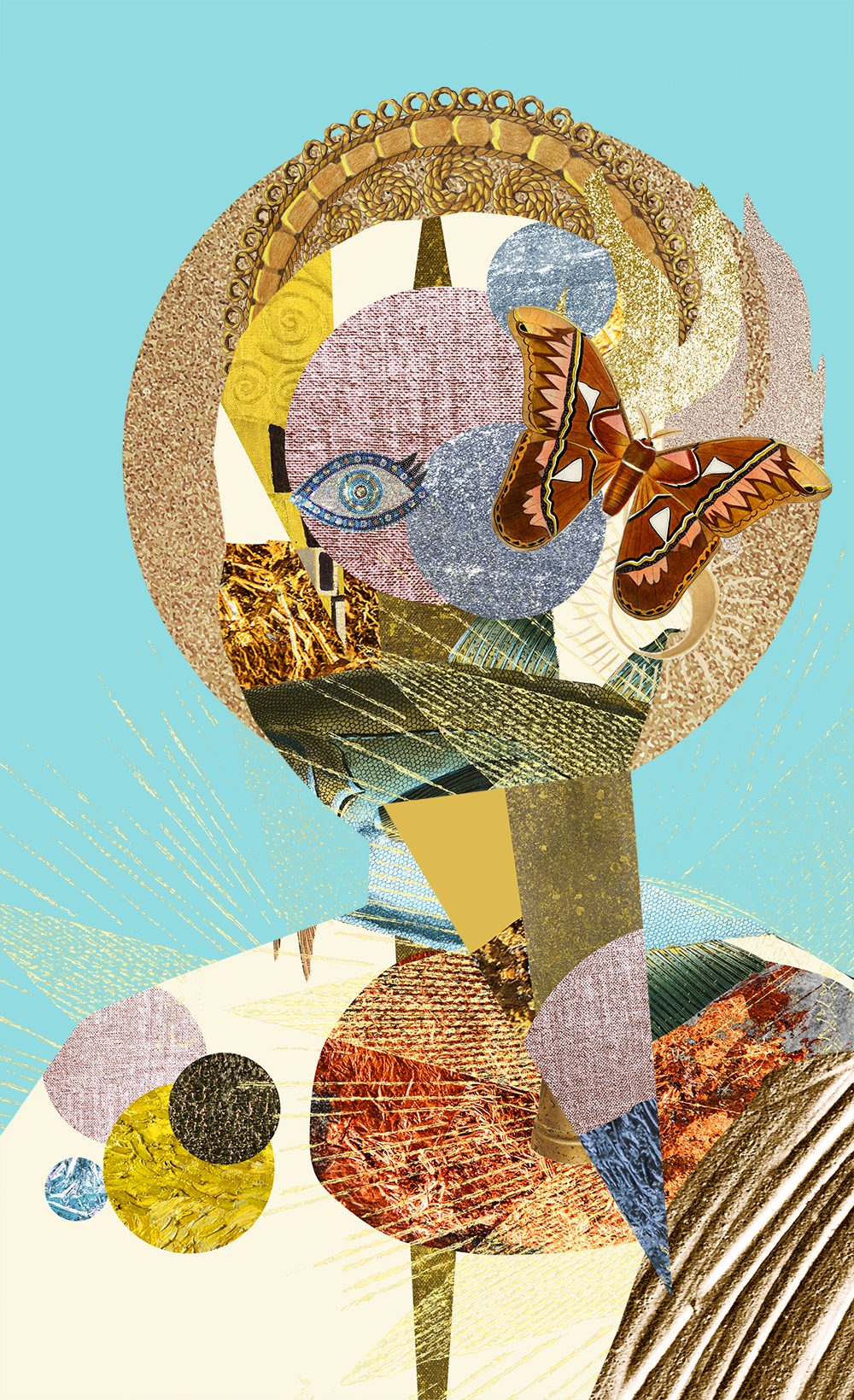
Composition Principles: Proportion
Composition refers to the arrangement of elements within an artwork. Although art is largely an intuitive practice, by breaking down and putting a spotlight onto individual elements we can evaluate and elevate our art. This series focuses on the principles within composition, so you can cherry-pick your favourite ideas and level up your art practice.
Let’s dive into today’s topic: PROPORTION!
Proportion Defined
Proportion refers to the relative size and scale of individual elements to each other and the division of elements within the overall design (very closely linked to balance).
When a correct relationship exists between the elements it adds harmony and balance. (source)
Ways to consider proportion in art:
Size of one area to the size of another area
Size of one element to the size of another element
Amount of space between two or more elements
(source)
Out of Proportion
If the proportions of a subject are incorrect (identified through comparison to another subject) an image will look unrealistic or abstracted – drawing emphasis.
An interesting way to think of proportion is that it’s usually not noticed until something is out of balance. (source)
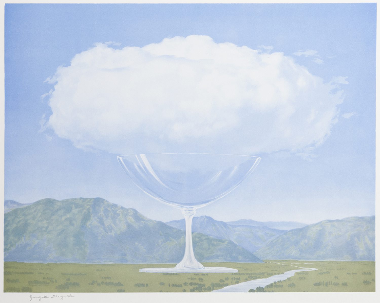
René Magritte – La Corde Sensible
Surrealist artist René Magritte known for juxtaposing mundane and fantastical iconography paints an out-of-proportion glass in La Corde Sensible. The glass in relation to the cloud is intentionally the wrong size and thus draws our attention.
Perfect Proportions
Perfection proportions of a subject will create realism. We can also view proportion in terms of the overarching canvas. Perfect division of elements within an artwork creates monotony but when the division is too unequal a piece of art can feel unbalanced. The perfect proportion is where an element is larger than another but not large enough to overpower the smaller element. (source 1/2)
Golden Ratio
One concept of creating perfect proportion within an artwork is the golden ratio, a mathematical theory, found in nature and often linked to art and design. Interestingly, a study on 565 works of art from great painters, calculated the ratio of the two sides of a painting. The average value obtained for the ratio of the sides was 1:1.34 significantly different from the value of the Golden Ratio of 1:1.618.
Despite the study’s findings, I think it’s important to look into the concept that is given a lot of attention in the art and design world. The golden ratio is best illustrated by a rectangle whose longer edge is 1.618 the length of its shorter edge. With this initial rectangle, you can draw a square inside and then another square inside the remaining rectangle, repeating the process indefinitely.
(source 1/2/3/4)
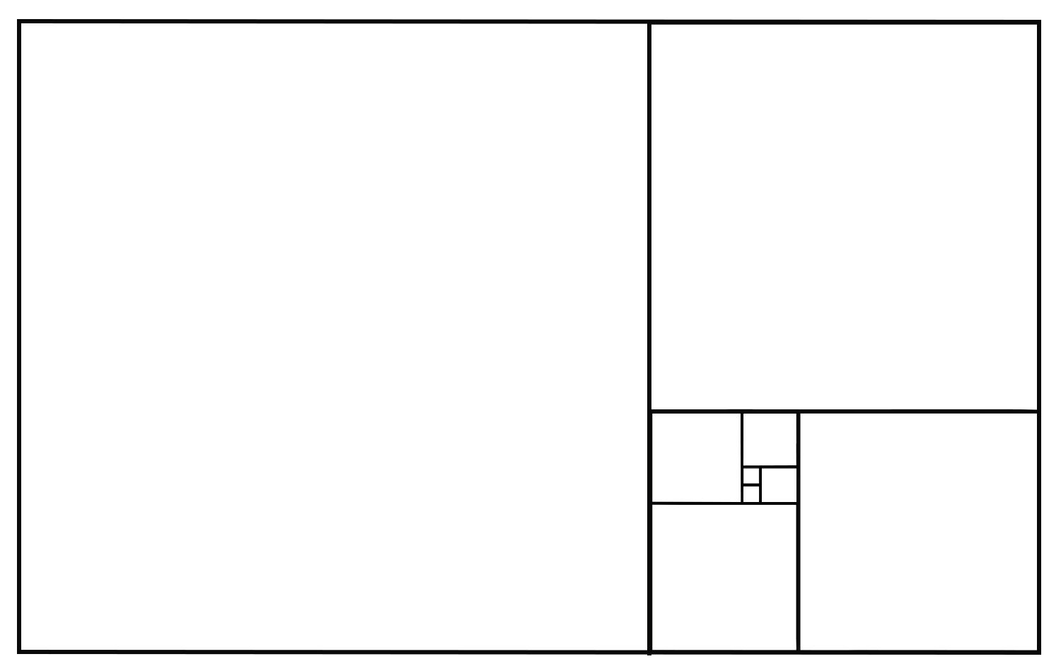
The Golden Rectangle
The initial box (using a 1:1618 ratio) is divided into a rectangle and a square. The rectangle that is created is then divided into another rectangle and a square. This sequence can be repeated forever though progressively harder to illustrate as the rectangle becomes smaller! By looking at the above graphic you can see how the smaller squares on the right balance the single largest square on the left. You can copy this layout in your art placing your focal points within the squares.
Points of Interest
/Golden Spiral
The golden spiral occurs when you connect the corners of the squares within the golden rectangle to create a spiral that coils inward. By placing the focal point of your work on the smallest section of the spiral your eye will naturally flow through the rest of the image. (source)

Golden Spiral overlayed upon the Golden Rectangle
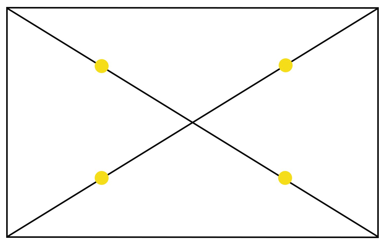
/Eyes of the Rectangle
You can find the points of interest within a golden rectangle by drawing two lines diagonally through the rectangle to form an X. Remember a golden rectangle will have the longer edge 1.616 times the length of its shorter edge. From the middle of the “X” to each corner, mark the midway point (the yellow dots indicate them on the image below). These eyes are the points of interest of the golden rectangle. (source)
/Rule of Thirds
The rule of thirds is another composition tool to help create proportion and balance. The easiest way to understand the rule of thirds is by using a grid that splits an image into nine equally sized rectangles. Applying the rule of thirds keeps the composition from being split in half either vertically or horizontally. Likewise where the lines intersect (the power points) helps steer artists away from placing their subject matter dead center or too close to the edge of your artwork. Correct proportion in a piece of art can be achieved by placing a secondary object or counterpoint at the opposing powerpoint. The rule of thirds powerpoints (although visually similar to those found in the golden rectangle) is not bound by using an initial rectangle with the side ratios of 1:1618. The grid can be applied over any sized image.
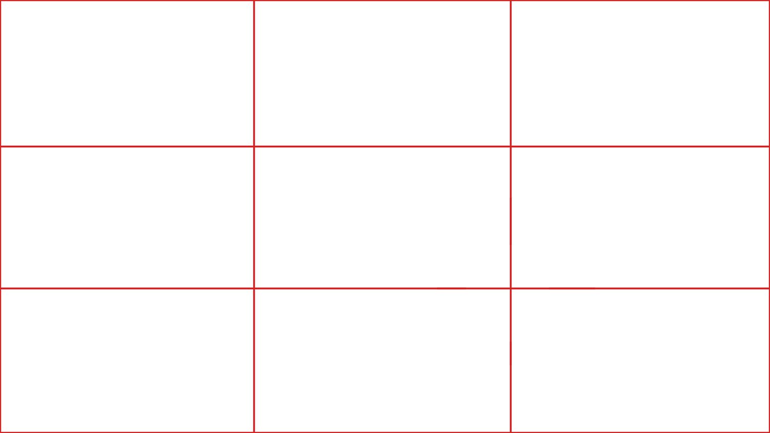
The rule of thirds encourages artists to place their horizontal line or subject matter off center.
HOMEWORK
Your homework this week (if this post confused the heck out of you!) is to watch this youtube video which explains the Golden Ratio Theory in an excellent way 🙂
Remember the Golden Ratio or the Rule of Two-Thirds don’t create great art, they’re simply methods that can lead to better proportions in art.
Sometimes the best art isn’t the art with the best proportions!
–
Want to see what else I do? Come peek over on my insta or grab a freebie when you sign up to my newsletter below 🙂 🙂