Composition Principles: Unity
Composition refers to the arrangement of elements within an artwork. Although art is largely an intuitive practice, by breaking down and putting a spotlight onto individual elements we can evaluate and elevate our art. This series focuses on the principles within composition, so you can cherry-pick your favourite ideas and level up your art practice.
Let’s dive into today’s topic: UNITY!
Unity Defined
Unity within an artwork is achieved when the visual elements of art complement rather than compete for attention. The artwork is seen as a cohesive whole rather than individual elements.
(source)
Conceptual Unity
Conceptual unity is when an artwork is unified through an idea/concept. (source)
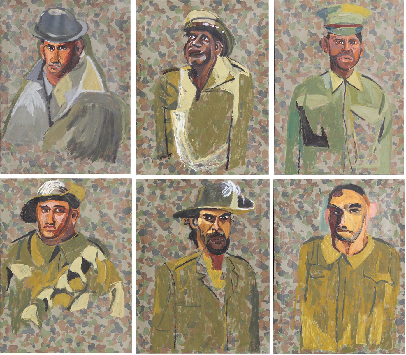
VINCENT NAMATJIRA – Weapons for the soldier
“In many ways, the contributions of Aboriginal soldiers in the Australian army have been overlooked. A lot of young Aboriginal men fought for this country, traveled overseas, and never came home, even though they weren’t treated with dignity and respect in Australia at the time. Despite the huge sacrifices these men made, their stories remain hidden, camouflaged in history. With this project, I’m trying to bring these unknown soldiers stories to the forefront.” – Vincent Namatjira (source)
Vincent creates unity in this collection by repeating camo in the canvas background and paint tones but he also creates conceptual unity by addressing the forgotten stories of Australian indigenous soldiers.
Compositional Unity

VINCENT VAN GOGH – Corridor in the Asylum
Vincent creates unity in his artwork through the repeated shape of the arches, colours, and textures.
Compositional unity is when visual elements are used to unite an artwork. Repetition is an easy way to link individual elements and create a cohesive, unified whole. An artist might repeat texture, shape, use of space, line style, or colour and value. I’ve covered repetition when discussing rhythm so instead, I wanted to dive into Gestalt psychology, a school based on the perception of the whole over individual components. (source). This psychology can be applied to art and specifically to the principle of unity, plus it’s a fun look into how our brain perceives images.
“Gestalt, a German word roughly meaning “configuration”, originated in the work of Max Wertheimer – with a number of thinkers influencing the development, including Immanuel Kant, Ernst Mach, and Johann Wolfgang von Goethe. Wertheimer and his followers identified instances where perception was based on seeing things as a complete whole, not as separate components. In the 1920s, designers began incorporating Gestalt principles in their work.” (source)
We’ll discuss below some of the Gestalt principles that look into the idea that our mind chooses to perceive things in their simplest form or organisation (Prägnanz). (source)
The Gestalt Principle of Similarity states that objects with similar visual qualities are understood to belong to the same group. (source)
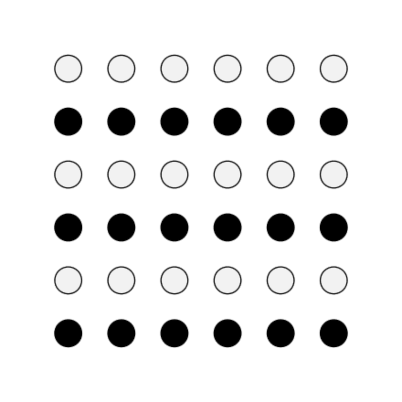
Gestalt Principle of Similarity
“The figure illustrating the law of similarity portrays 36 circles all equal distance apart from one another forming a square. We perceive the dark circles as grouped together and the light circles as grouped together, forming six horizontal lines within the square of circles. This perception of lines is due to the law of similarity.” (source).
In the illustration, the circles are grouped due to their value (light or darkness) but you can repeat any visual element (colour, form, line, shape, space, texture).
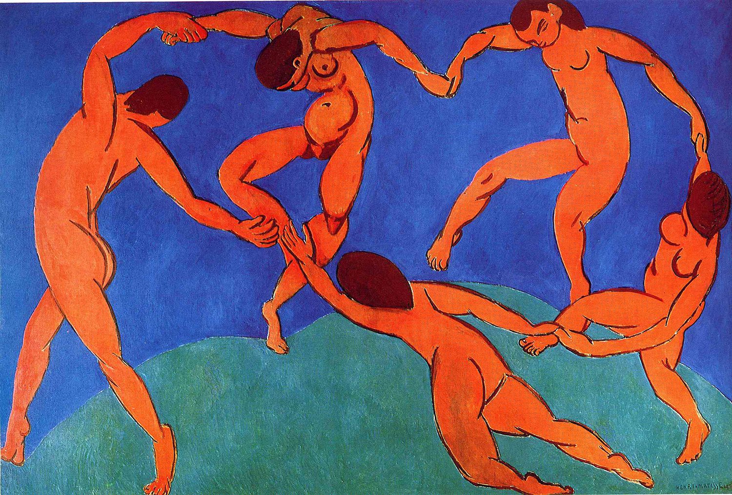
In Dance (II) our eyes group the orange figures together – through their repeated shape (subject matter) and colour.
“The principle of proximity states that objects near each other tend to be viewed as a group”. (source)
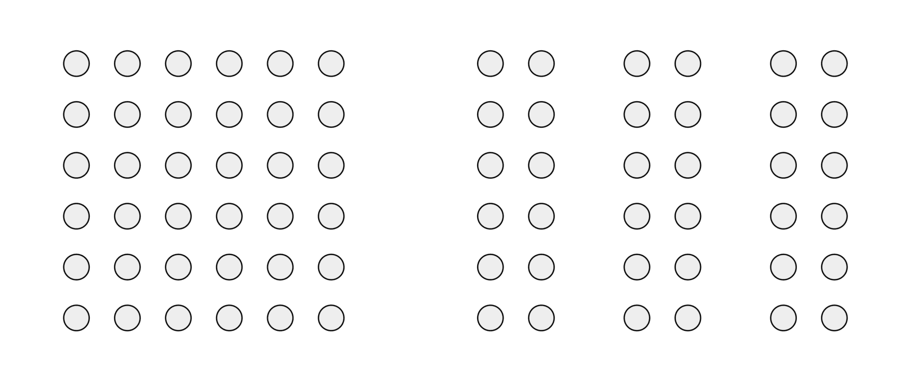
Gestalt Principle of Proximity
“In the figure illustrating proximity, there are 72 circles, but we perceive the circles in groups – a group of 36 circles on the left side and three groups of 12 circles on the right side of the image.” (source)
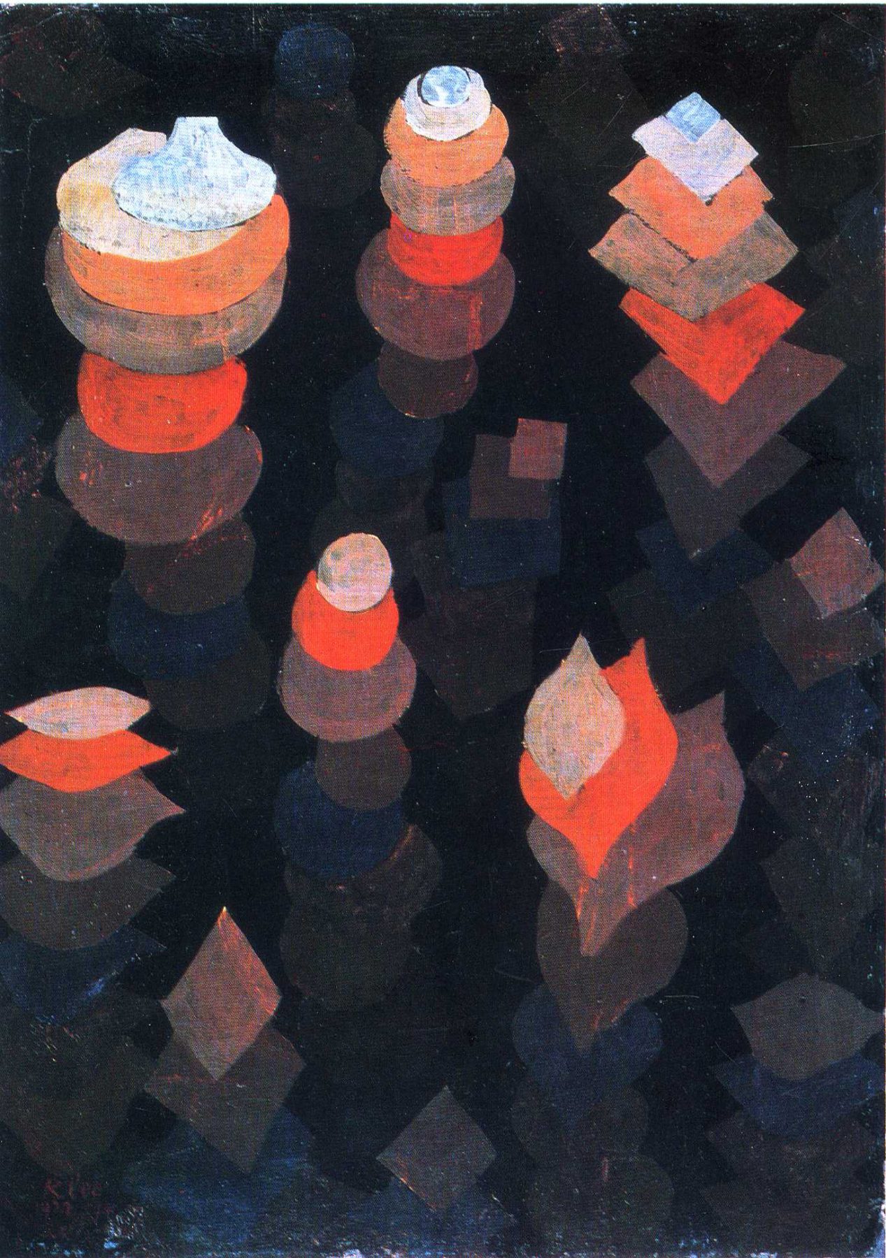
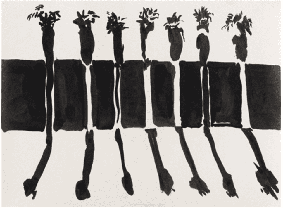
PAUL KLEE – Growth of the Night Plants
Instead of seeing a bunch of random shapes our brain groups them together due to proximity. Paul Klee ties the work together with colour and value and repeated shapes.
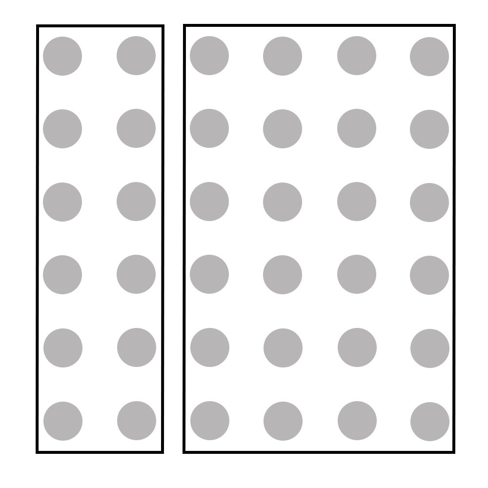
Gestalt Principle of Common Region
The illustration shows 36 evenly spaced dots but we perceived two groups due to the bounding boxes.
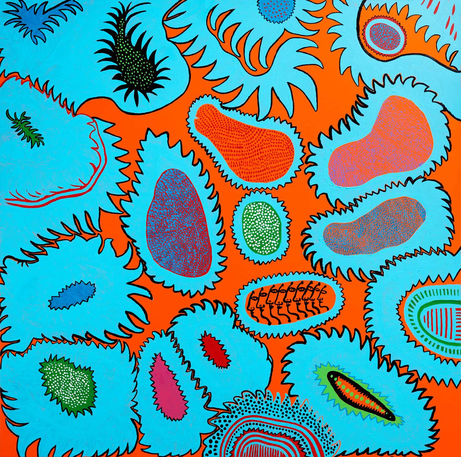
YAYOI KUSAMA – Talks of a Flower Garden
In Talks of a Flower Garden, our eye groups together the elements within the bounding shapes. Kusama unifies the piece, through similar shapes and lines and the repeated blue colour.

Gestalt Principle of Continuation
“The figure depicting continuity shows two crossed keys. When the image is viewed, we tend to perceive the key in the background as a single uninterrupted key instead of two separate halves of a key”. (source)
We are able to see complete palm trees in Wayne’s painting due to the principle of continuation.
Colour Harmony
It’s important to touch on colour harmony as colour is a valuable visual element in creating unity. I’ve done a whole series on colour which you might be interested in reading HERE but for now, I’ll touch lightly over the schemes which help create unity using the following Paul Cézanne example. Cézanne’s painting is unified by repeating texture and shape but largely by its colour palette.

Paul Cézanne – Montagne Sainte-Victoire
Paul uses three harmonious colour schemes:
Analogous/Adjacent
A group of three colours next to each other on the wheel. These colours are the most similar and thus harmonious when placed together. The painting uses blue, blue/green and green.
Monochromatic
A colour scheme that uses one colour in a variety of tints and shades. You achieve a tint by adding white to it and a shade by adding black. In this case, Paul uses a variety of tints and shades.
Split Complementary
This scheme uses the two colours next to its complementary colour. Blue’s direct complementary colour is orange, but in a split complementary, red/orange and yellow/orange are used. The split complementary scheme is a more harmonious colour palette than the direct contrasting complementary colour(blue/orange). Still confused? Check out this entry on the colour blue with lots of visual examples!
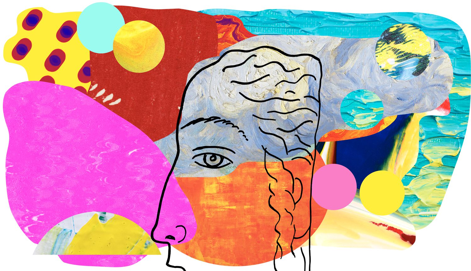
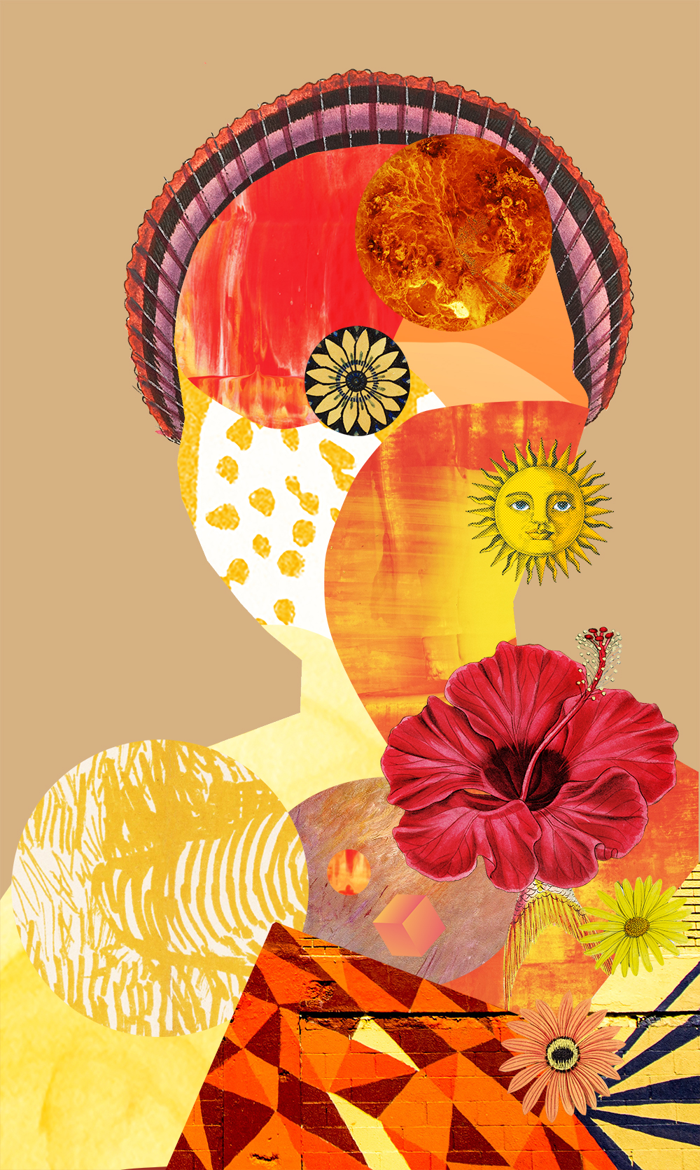
HOMEWORK
Your homework this week is to look at the following art and suggest why it’s a unified piece of art. I’ve placed my interpretation below if you need any help 🙂
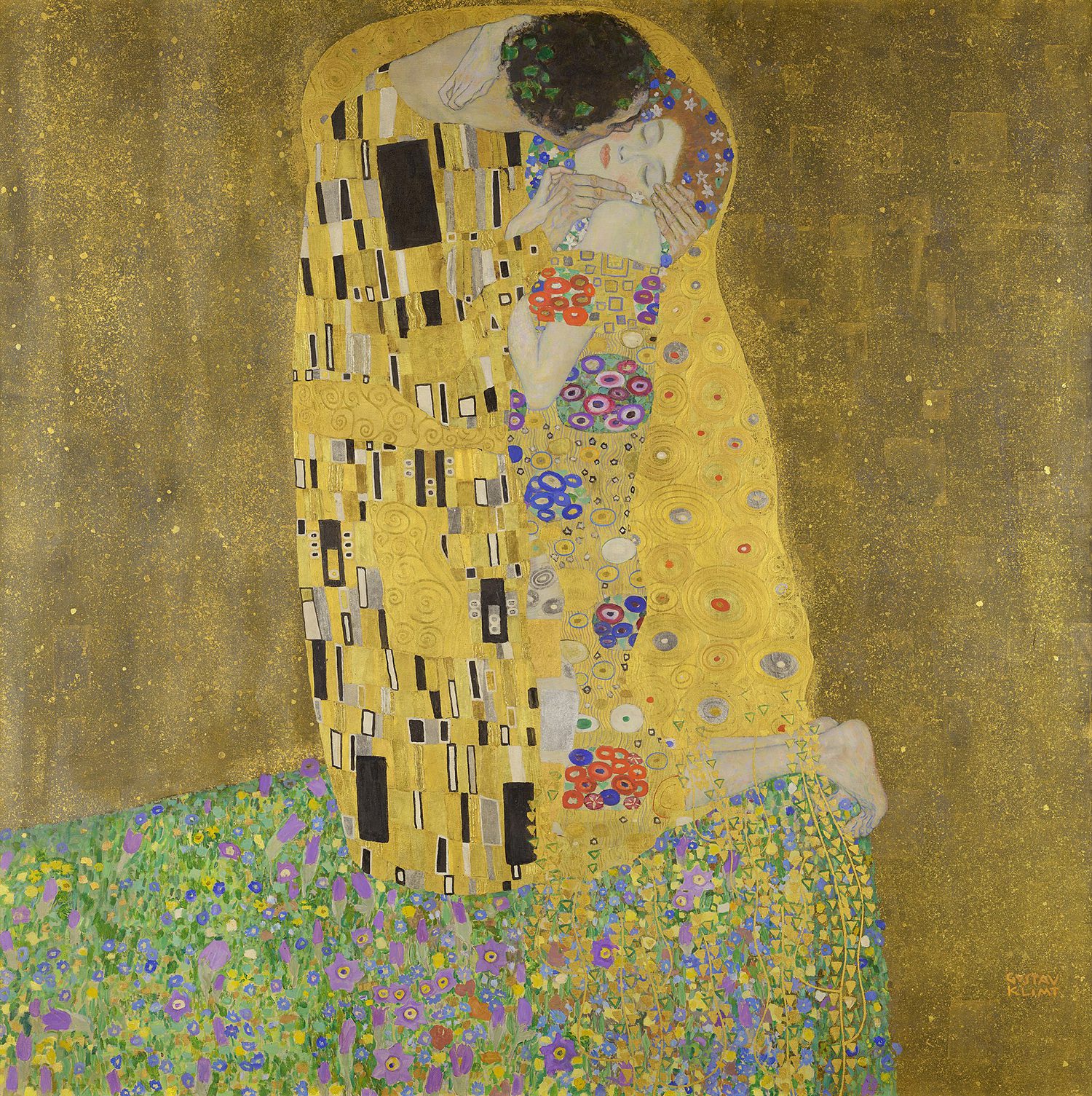
Interpretation: Klimt uses the principle of common region (grouping objects in the same closed region) and the principle of proximity (placing objects near each other). The Kiss also uses a harmonious colour palette to unify the work. Klimt uses a split complementary colour scheme (yellow/green, red, violet) and (yellow, yellow/green and green) as an analogous/adjacent colour scheme.
–
Want to see what else I do? Come peek over on my insta or grab a freebie when you sign up to my newsletter below 🙂 🙂