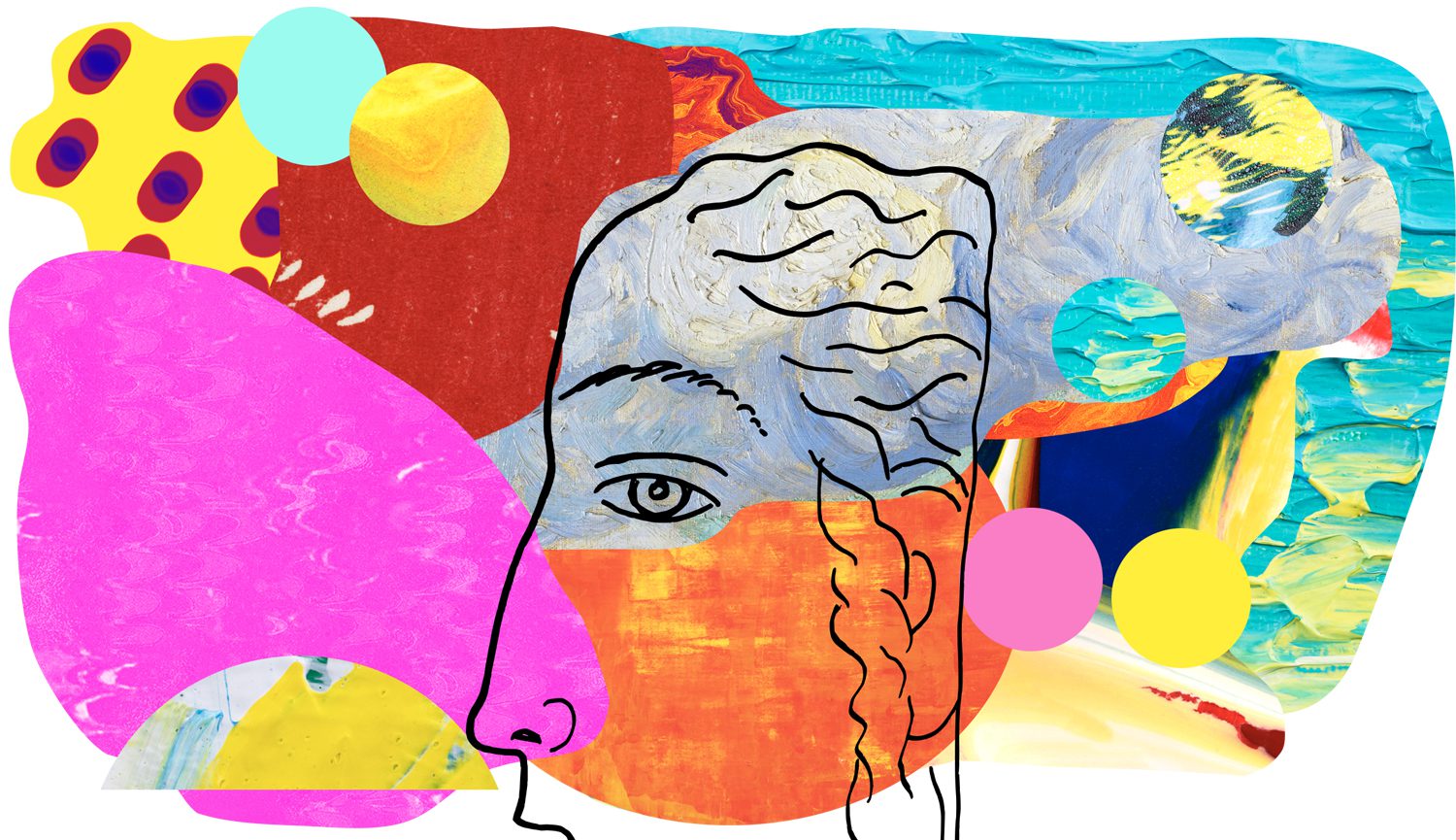
Composition Principles: Value
Composition refers to the arrangement of elements within an artwork. Although art is largely an intuitive practice, by breaking down and putting a spotlight onto individual elements we can evaluate and elevate our art. This series focuses on the principles within composition, so you can cherry-pick your favourite ideas and level up your art practice.
Let’s dive into today’s topic: VALUE!
VALUE DEFINED
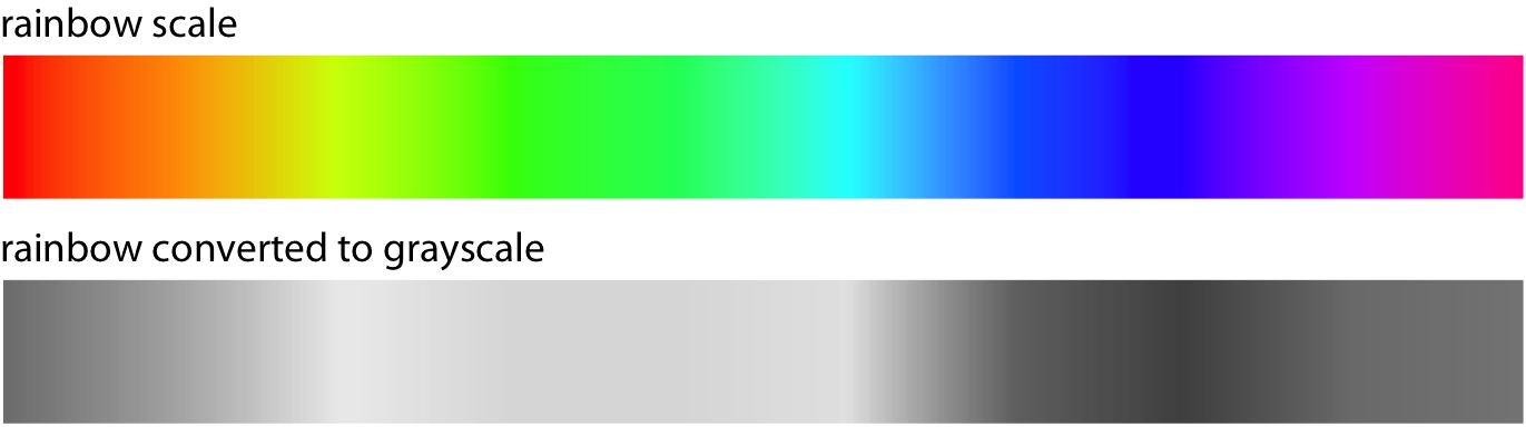
Lightness and darkness are known as value in visual art. The more light that is reflected, the higher the value. White is the highest or lightest value while black is the lowest or darkest value. Colors also have value; for example, yellow has a high value while dark blue has a low value. (source). It’s important to think about how light and dark are arranged together, as value is an incredibly important element in creating visual impact.
WHITE = HIGHEST/LIGHTEST VALUE
BLACK = LOWEST/DARKEST VALUE
(source)
When converting colours to greyscale you can see yellow has the highest luminance value (perceived brightness of a colour) and dark blue has the lowest.
LOW KEY VS HIGH KEY
LOW-KEY
Low-key is when dark values dominate the artwork. With low-key art, the eye is drawn to any light values (source). Let’s look at the painting below!
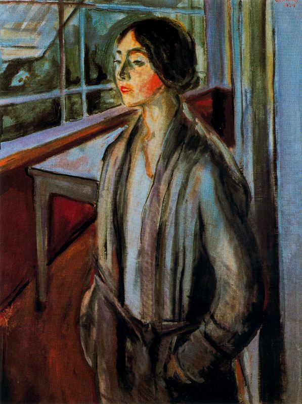
EDVARD MUNCH – Woman on the Verandah
Edvard Munch is a great example of an artist implementing low-key values in his work.
The whites and yellow (high values) are used sparingly to draw our eye as they contrast against the dark values.
HIGH-KEY
High key refers to when light values dominate the scene. In high-key artworks, any dark values will draw the eye (source). Georgia O’Keeffe’s painting demonstrates below.
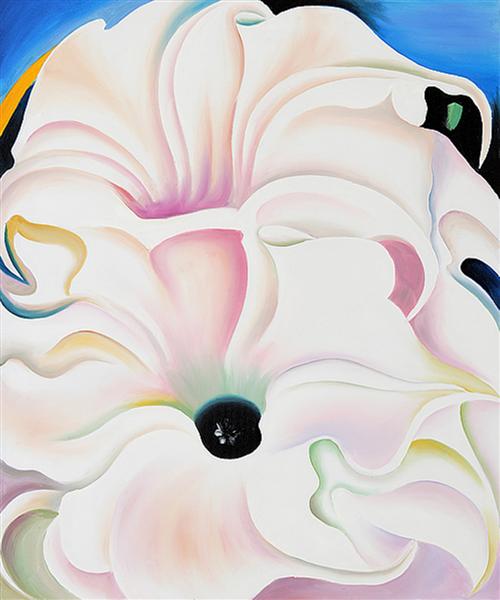
GEORGIA O’KEEFFE – Bella Donna
In Bella Donna, Georgia uses high-key values (white, yellow, pastels) and in doing so the eye is naturally drawn to the dark values of the paintings, the blacks and blues.
Value and Contrast
Contrast is important in art as it adds excitement to a work. ‘Value’ is an element of art whilst ‘contrast’ is a principle. We can use value to play with contrast and provide focus within the art. A practical way to do this is having extreme contrasts of dark and light around the focal point/s and then mid-range values elsewhere to prevent competition.
An artwork with too little contrast becomes monotone and dull. Of course, contrast can be achieved through any difference (colour, texture, shape, line, size, space) which we’ll explore later in the series but today it’s all about value!
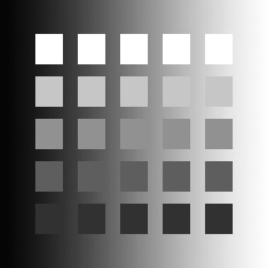
You can see in the above model that (the perception of) the whitest square is the one with the darkest background (top left). The greater the difference in value between the object and its background, the greater the contrast.
“The contrast in art is closely related to the
variety [and] is employed to create the rhythm,
or to strengthen the focus of the artwork.”
(source)
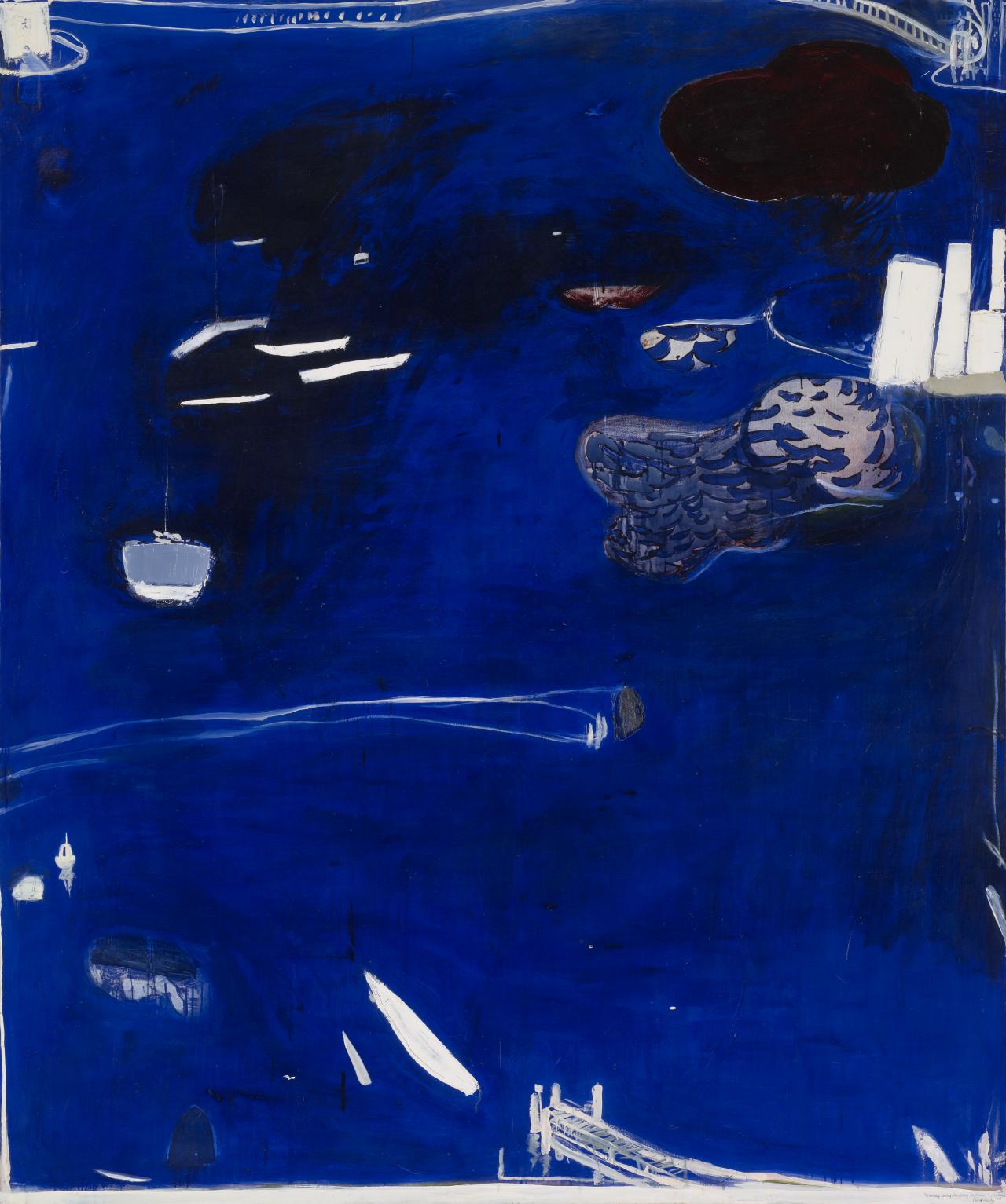
BRETT WHITELEY – Evening coming in on Sydney Harbour
You can see how the white’s pop in Brett Whiteley’s painting. If you remember from the colour to greyscale conversion earlier, dark blue has one of the lowest luminance values which makes the contrast to the white more severe. Another word for this relationship is counterchange which creates strong contrast and an impactful artwork. Brett also plays with rhythm as your eye darts across the white elements on the work.
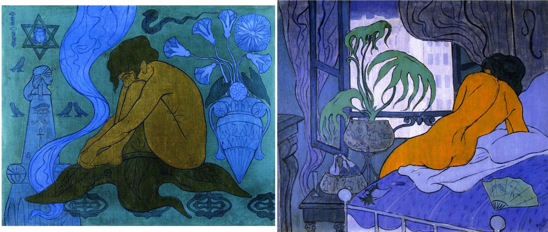
Take a look at these two similar paintings above by Paul Ranson. Which do you prefer?
I’d argue that the painting on the right has the strongest composition due to its use of value.
The painting on the left has very similar values, whilst the painting on the right draws our eye in through the body and light window.
HOW TO IDENTIFY VALUES IN YOUR ART
If you work in black and white then seeing value in your art will be obvious. If you work in colour there are a few tricks to help you see your values more easily!
1) Squint (or remove your glasses)! This might seem silly but we’ll test it out below to see if it works!
2) Take a photo of your work and view it on your phone or camera viewfinder – reducing the size will hopefully make the values more pronounced. Or you can physically step back from your art.
3) If squinting or reducing the size isn’t obvious enough, you can take a photo of your work and convert it to black and white with an editing software (or using a b&w filter directly on your camera or phone).
(source)
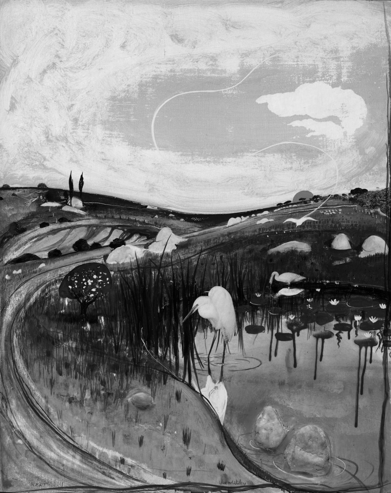
Values Exercise
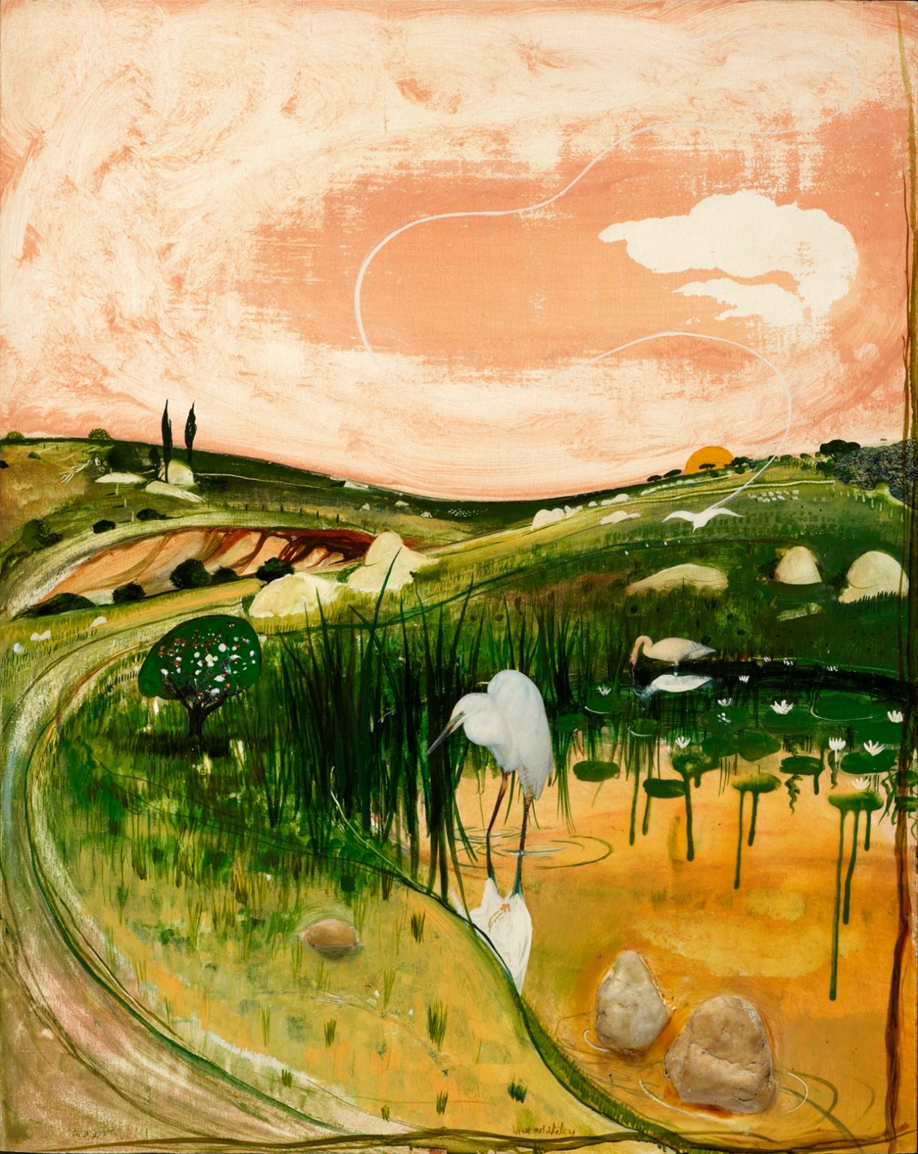
BRETT WHITELEY – Marulan Bird with Rocks
Try squinting (or removing your glasses) and see if you can more easily identify the values in this coloured painting. If you’re struggling with the squint method can you literally move away from your desktop/phone/tablet? Does viewing the art smaller help identify the values? Below, I’ve converted the art to b&w so you can double-check your ability!
Ratio of values in your work
Artist Robie Benve argues for the, “most, some, and a bit” rule when it comes to the ratio of values. For example, most dark values, some mid-values, and a bit of light values. Robie states that the “most, some, and a bit” combination of values is more dynamic than dividing the values equally. I believe the best way to find the perfect ratio of values is to do your homework this week (at the bottom of this post).
How did you go? Were you able to directly identify the values from earlier?
HOMEWORK
Your homework this week is to get your squint on and start taking notice of the ratio of values within art that you love. This is going to be a lifelong practice and one that will hopefully encourage you to see the values in your own work to evaluate your practice and hopefully elevate it! If you want your painting to leave an impression on your audience don’t forget to play and change your values!
–
Want to see what else I do? Come peek over on my insta or grab a freebie when you sign up to my newsletter below 🙂 🙂