Composition Principles: Variety
Composition refers to the arrangement of elements within an artwork. Although art is largely an intuitive practice, by breaking down and putting a spotlight onto individual elements we can evaluate and elevate our art. This series focuses on the principles within composition, so you can cherry-pick your favourite ideas and level up your art practice.
Let’s dive into today’s topic: VARIETY!
Variety Defined
Variety in art refers to the use of different qualities or instances of the visual elements.
To best explain, I’m going to go through the seven elements of art and ways to add variety into each.
(source)
Harmony Vs Variety
A quick side note, harmony is the opposite of variety. Too much harmony and art risks becoming boring – too much variety and you may end up with an artwork full of chaos and disorder. If you managed to balance harmony and variety you’ll hopefully achieve an artwork with a proportioned amount of visual interest.
(source).
How the 7 elements can create variety
Colour/Value
The three primary ways to vary colour:
/value (how light or dark a colour is)
/saturation (how intense a colour is)
/hue (the use of colour variations)
(source)
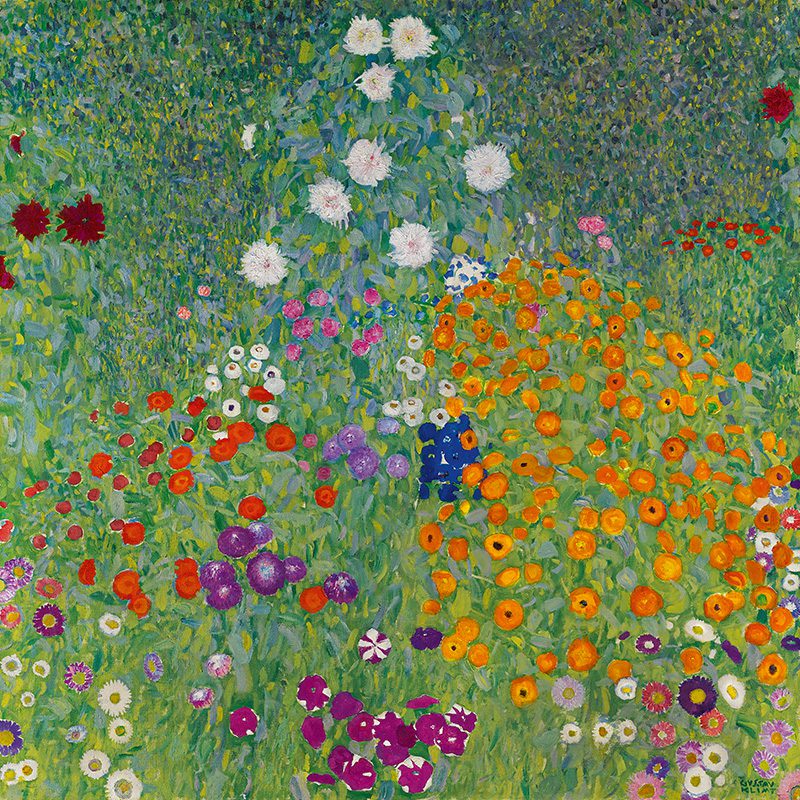
Klimt uses a variety of colours in Blumengarten but with enough restain to prevent chaos. He uses complementary colours (red and green – opposite each other on the colour wheel) and a spectrum of values (whites for light values and violet, burgundy and deep blue for dark). The painting also plays with different saturation levels.
Line
The different ways you can vary lines/strokes
/thick or thin
/broken or continuous
/long or short
/straight or curved
/vertical/horizontal/diagonal or zigzag lines
Remember to think about the material you’re painting on and the way you hold your brush. Holding your hand close to the bristles will give more accurate lines, holding away from the bristles will produce looser marks. Consider the pressure, angle, and amount of paint you use. A dry brush (just loaded with paint) will produce different results than a brush first dipped into water. (source)
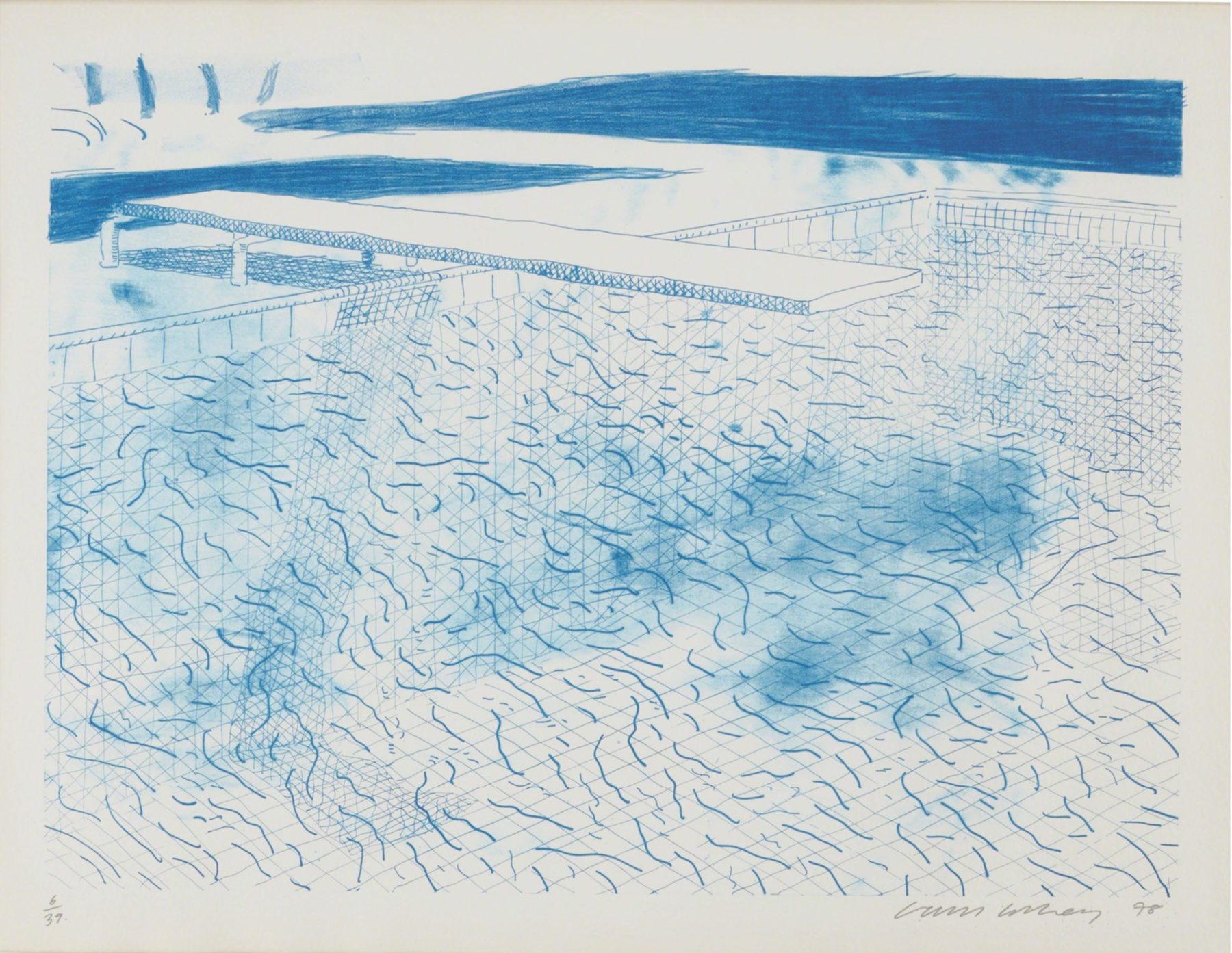
DAVID HOCKNEY – Lithograph of Water Made of Lines
David uses one colour but a variety of lines to create interest and movement. He employs, curvy, horizontal, vertical, and diagonal lines altering his line thickness.
Shape/Form
To avoid shape uniformity below are different ways to vary shapes.
/size changes
/geometric, organic or abstract shapes
/simple or complex shapes
/edge variance (solid or soft)
/shape (2d) or form (implied 3d)
(source)
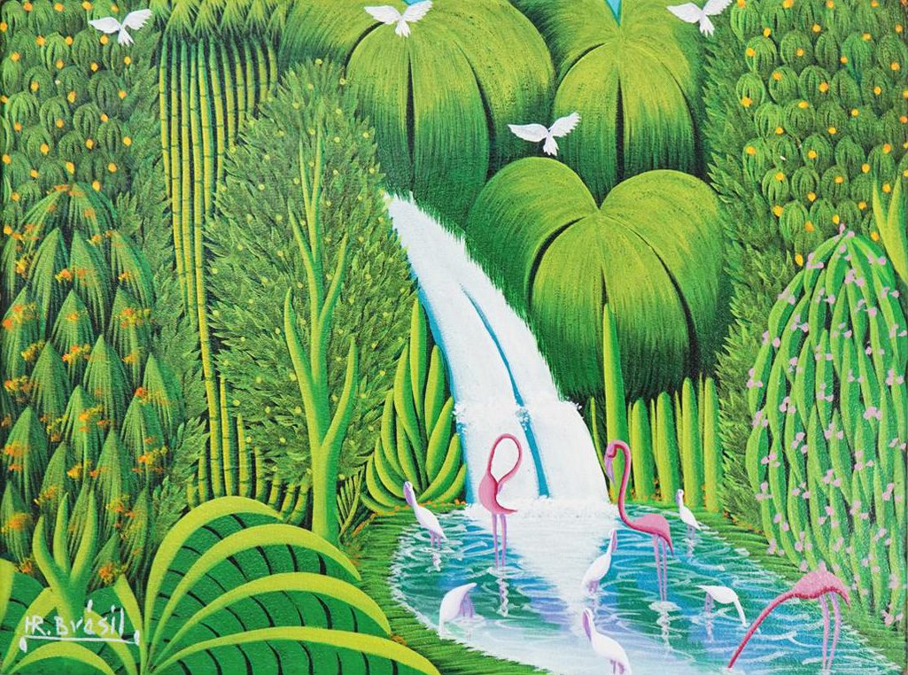
Henri repeats shapes but creates variety through different forms and sizes.
Texture
You can vary texture to create more visual interest and diversity. Soft texture is achieved by limiting contrast, rough texture will have sharp changes between values (darks and lights). To learn more about texture click HERE.
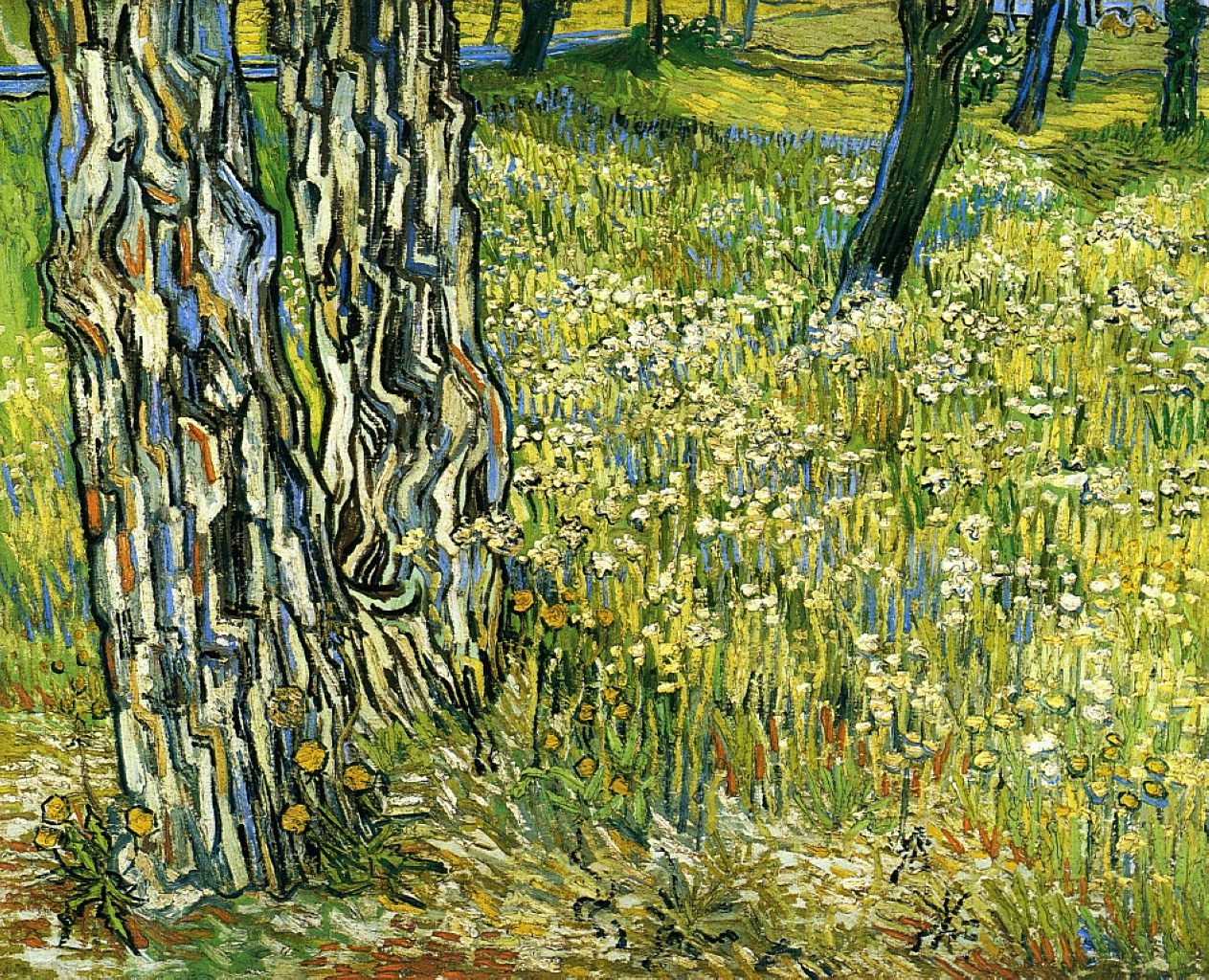
VINCENT VAN GOGH – Tree Trunks In The Grass
Vincent uses brush strokes and built-up paint to imply texture. The sharp contrasts of values on the trunk imply a rougher texture than the gradual value changes of the flowers and grass.
Space
To bring variety into the element of space, try to avoid having uniform spacing and vary the amount of negative to positive space.
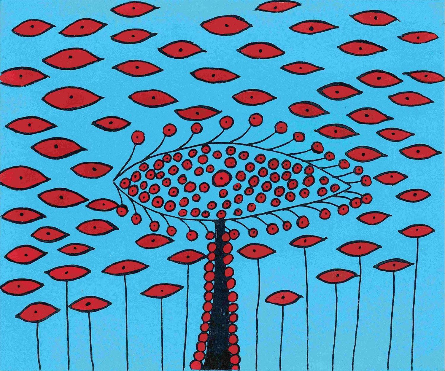
Yayoi adds variety by changing up the ratio of positive to negative space in her artwork above.
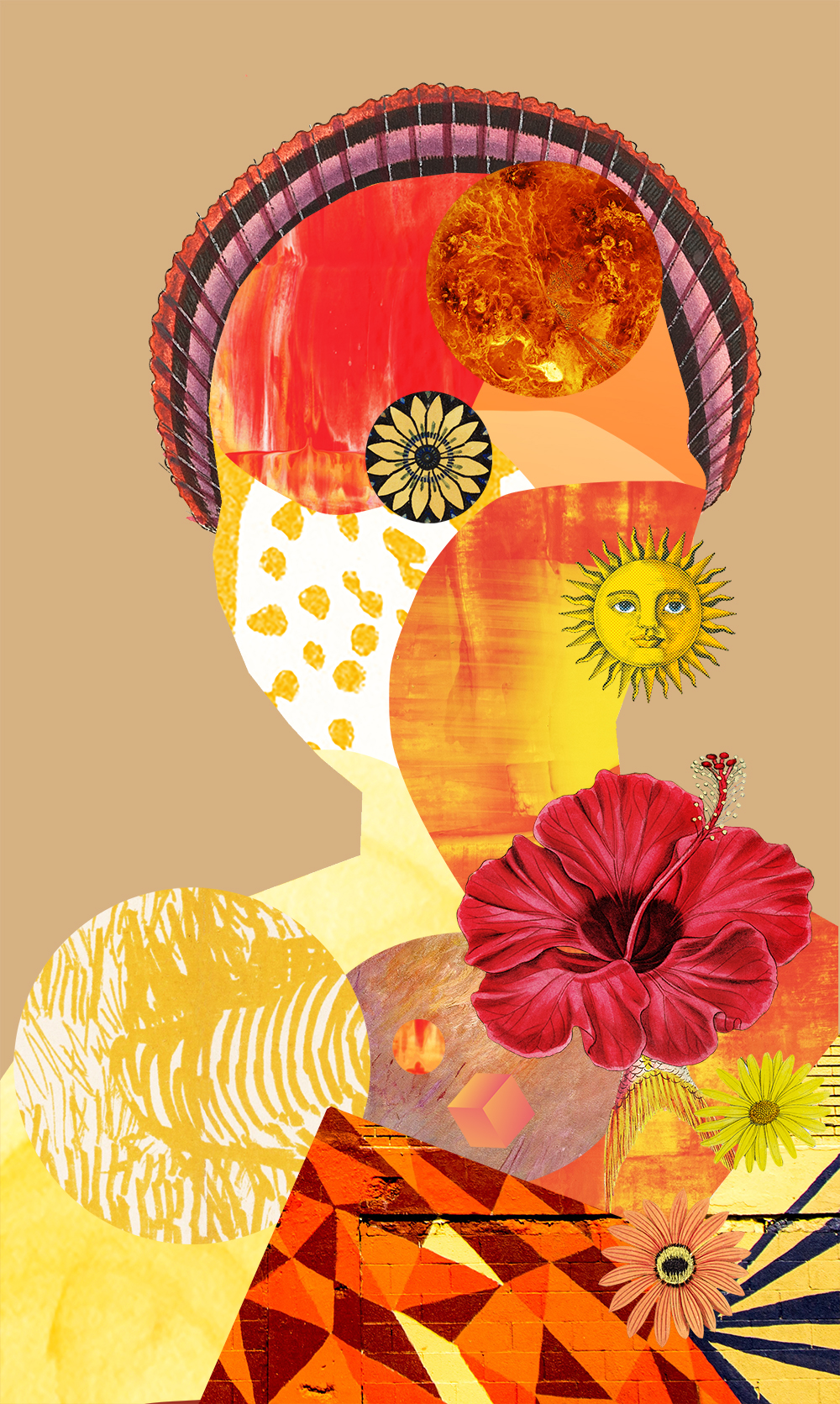
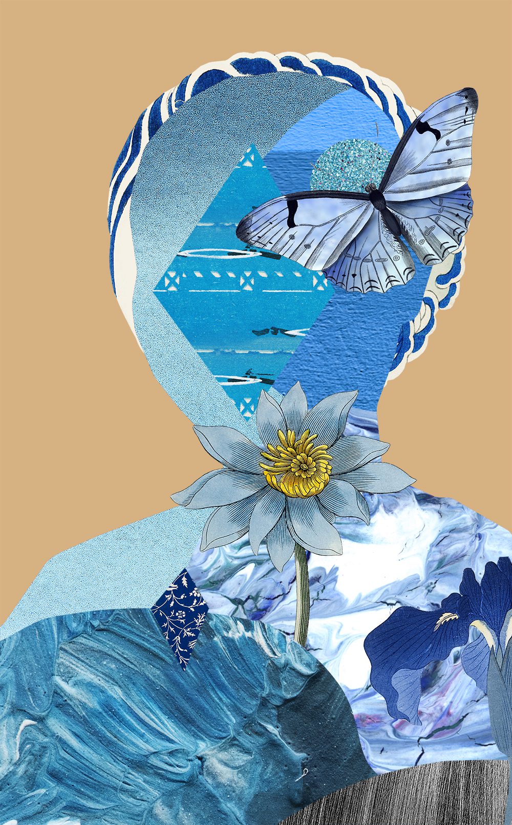
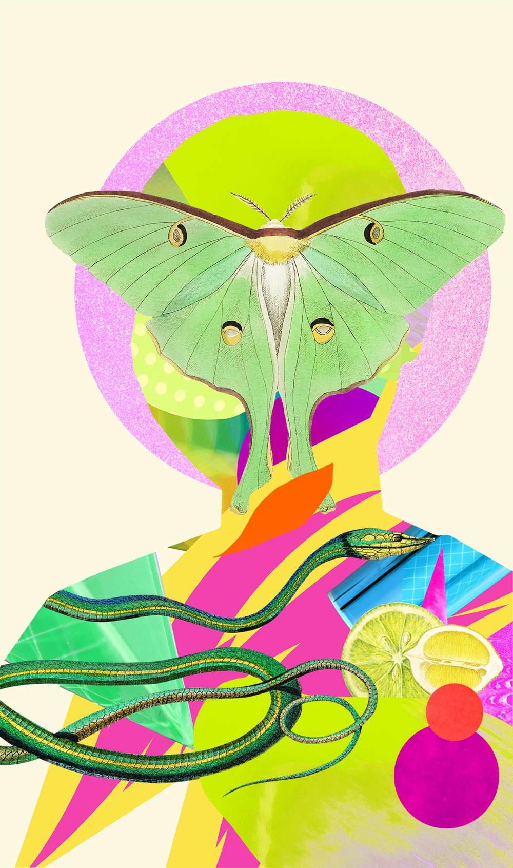
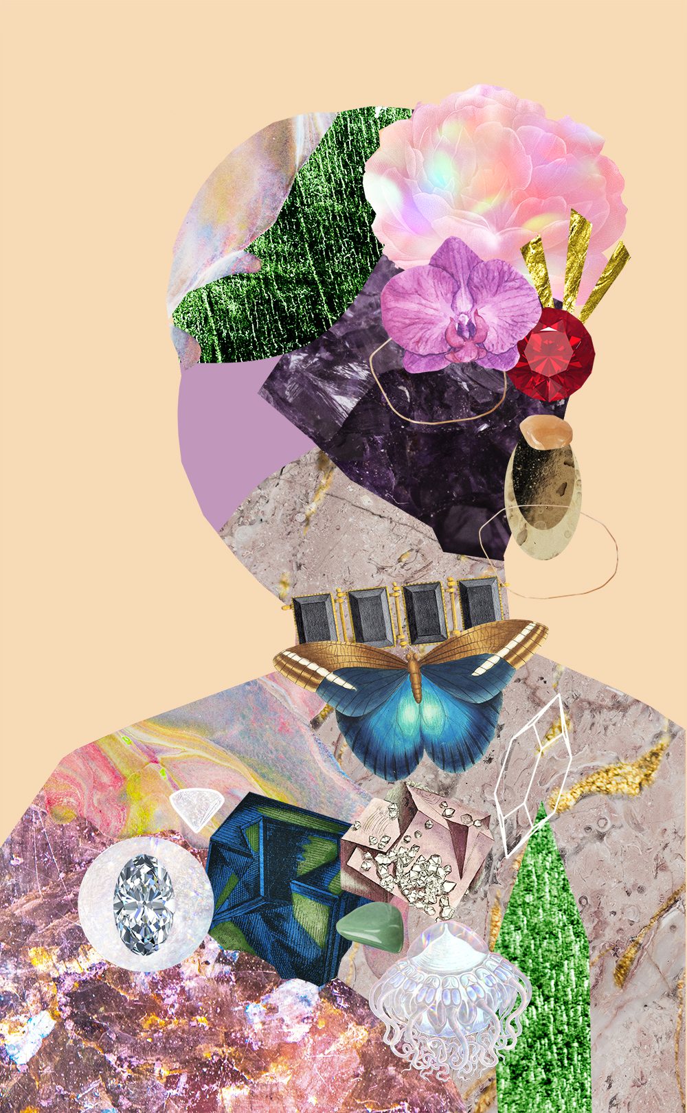
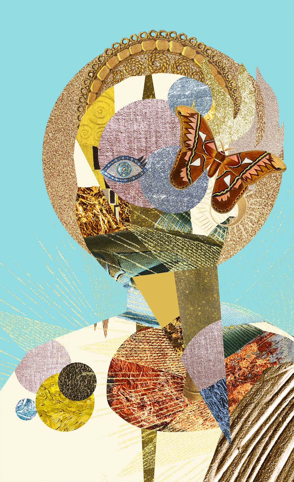
HOMEWORK

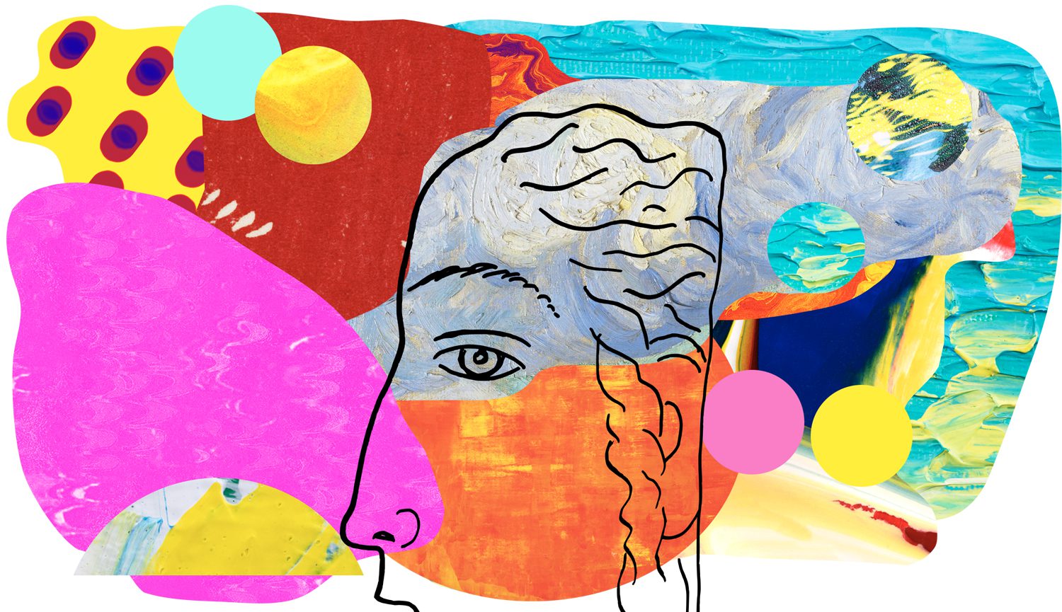
EXPLANATION: Madigan varies her negative and positive space, she also has variations in shapes, saturation, and value. As a side note, she restrains variation through using repeated dots, colours, and texture.
–
Want to see what else I do? Come peek over on my insta or grab a freebie when you sign up to my newsletter below 🙂 🙂