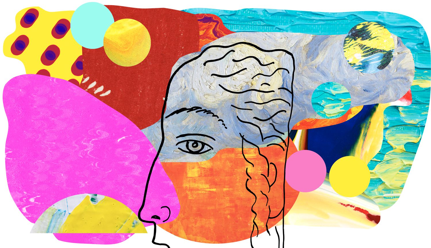
Composition Principles: Contrast
Composition refers to the arrangement of elements within an artwork. Although art is largely an intuitive practice, by breaking down and putting a spotlight onto individual elements we can evaluate and elevate our art. This series focuses on the principles within composition, so you can cherry-pick your favourite ideas and level up your art practice.
Let’s dive into today’s topic: CONTRAST!
Contrast Defined
Contrast is the juxtaposition of differences in order to intensify the properties of each. In art, contrast is achieved when opposing elements are arranged together. An important art principle, contrast is used to create visual interest and focal points – the hero areas of an artwork. (source 1/2/3)
HIGH VS LOW CONTRAST
Contrast can be high or low. High contrast is achieved by elements in opposition and draws the most attention whilst low contrasting elements blend together to create a uniform appearance. An artwork that only has high contrasting elements can be bold and erratic whilst an artwork with only low contrast can risk being monotonous. You can find balance in utilising both with your art (source).
FOCAL POINT
The greatest area of contrast in an artwork creates the focal point of the piece. Where the lightest light and darkest dark meet will be the area of strongest contrast. Value (light and dark) isn’t the only way to achieve contrast, below we’ll go through the seven elements and how contrast plays a role in each. (source)
7 Elements Using Contrast
Colour
Below are four ways to employ contrast when using colour.
* Contrasting Colour Schemes
– Complementary Colours: the opposite colours on the colour wheel
– Triad Colours: three colours of equal distance on the colour wheel
– Tetrad/Double Complementary Colours (rectangle or square): two pairings of complementary colours
* Colour Saturation: utilising the contrast between pure colours and less saturated tints and shades (tints are achieved by mixing white paint with pure colours and shades by mixing black with pure colours)
* Temperature Contrast: warm colours used against cool colours. Cool colours (green, blue, violet) sit on one side of the colour wheel and warm colours (red, orange, yellow) appear on the other.
* Proportion Contrast: Contrasting the proportion of colours used.
Colour is a HUGE topic and I encourage you to dive deeper HERE 🙂
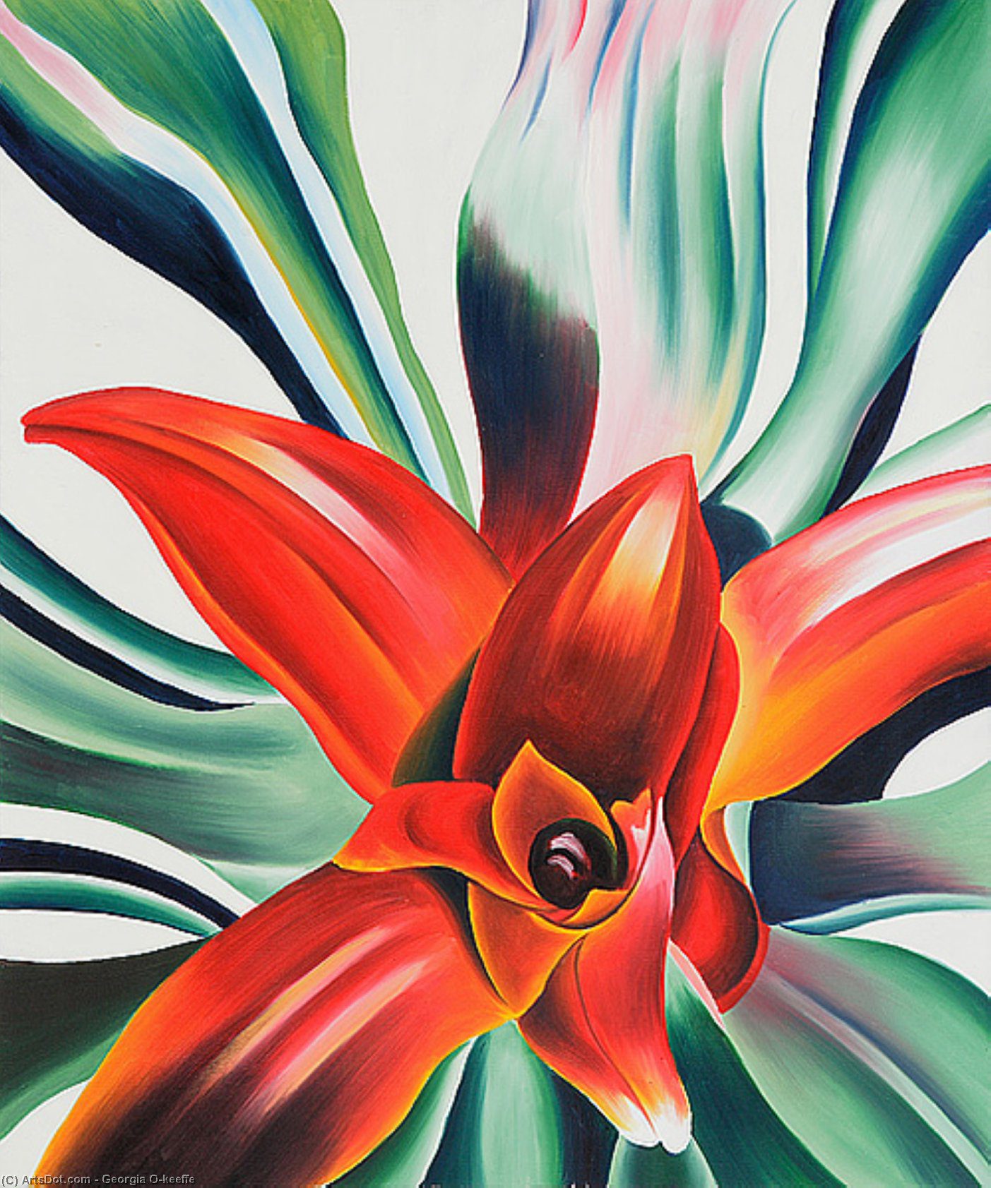
GEORGIA O’KEEFFE – Leaves of a Plant
Georgia contrasts complementary colours red and green (opposite colours on the colour wheel). She also plays with saturation and value to create contrast.
Line
Lines can be contrasted through shape and texture, length, and width. Read more about the element line HERE.
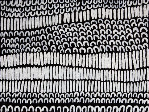
LENA NYADBI – Jimbirla and Lirlmim
Lena uses a combo of curved and straight lines which contrast against each other. She also uses the strong contrast value of white against black.
Shape
Shapes can be contrasted by size or design (geometric, organic, and abstract). Read more about shapes HERE.
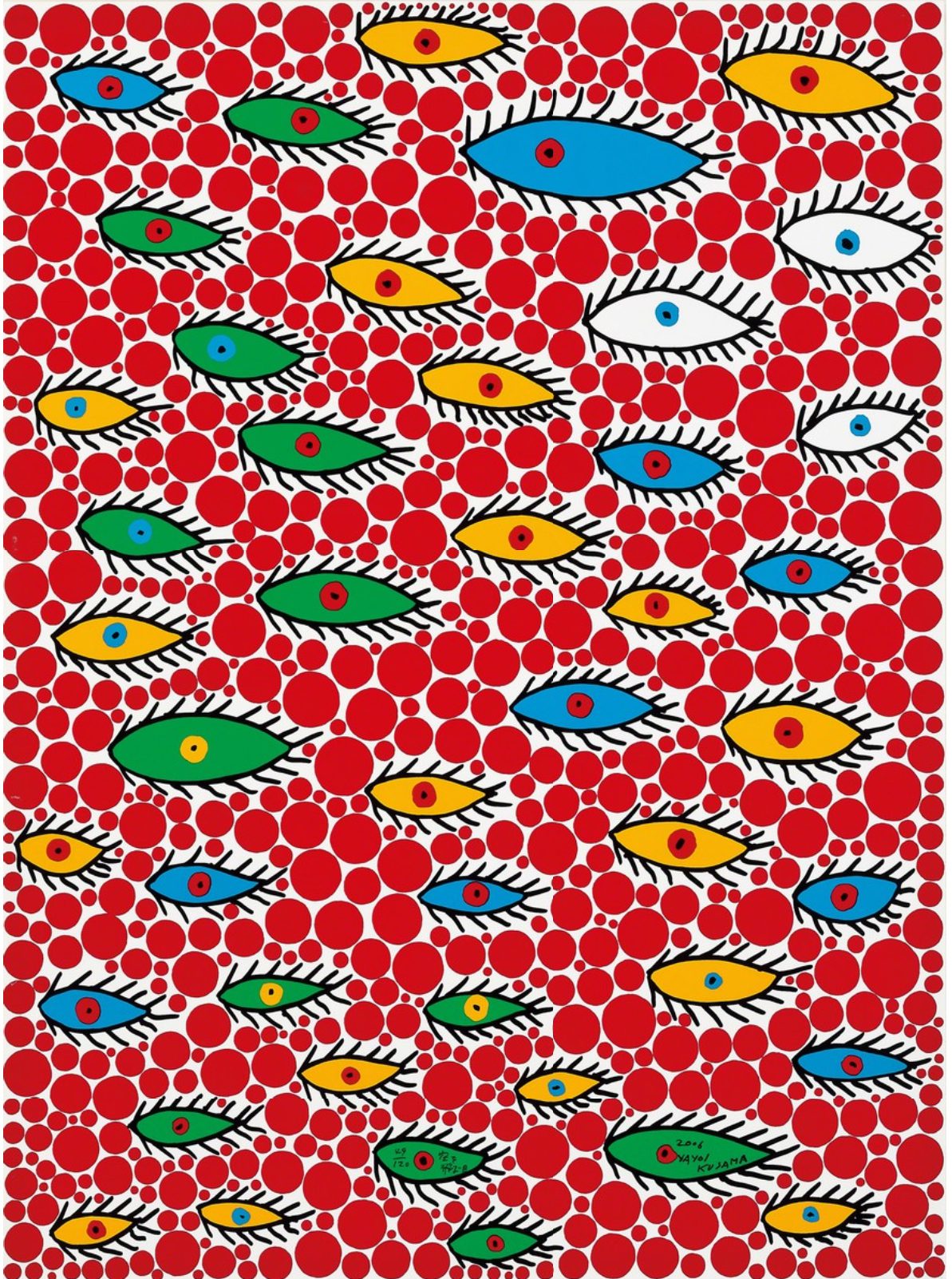
YAYOI KUSAMA – Eyes Flying in the Sky
Yayoi contrasts simple geometric shapes (circles) with organic eyes. She also varies sizes to add more contrast and utilises contrasting colours red and green.
Form
Form is the 3d illusion of a shape (in 2d art). Like shapes, you can contrast forms by size or design. Read more about form HERE.
Space
The contrast between a blurry background and a sharp foreground helps create Atmospheric/Aerial Perspective. This type of perspective relies on conveying depth through value changes, colours, and visual clarity. The contrast of negative to positive space can also be used as a contrast element. You can read more about it HERE
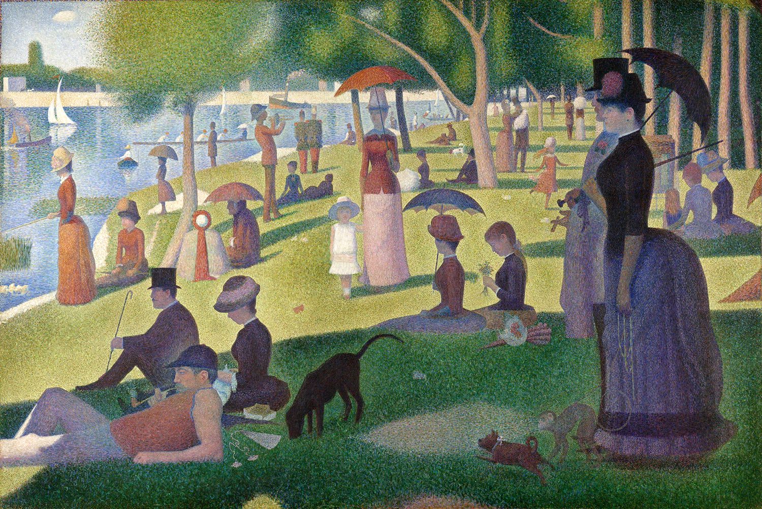
GEORGES SEURAT – A Sunday Afternoon on the Island of La Grande Jatte
In the above painting, the details of the foreground contrast against the lack of details in the background.
Texture
Soft texture is achieved by limiting contrast, rough texture will have sharp changes between values (darks and lights). Textured areas against untextured areas can also create contrast within a piece. To learn more about texture click HERE.
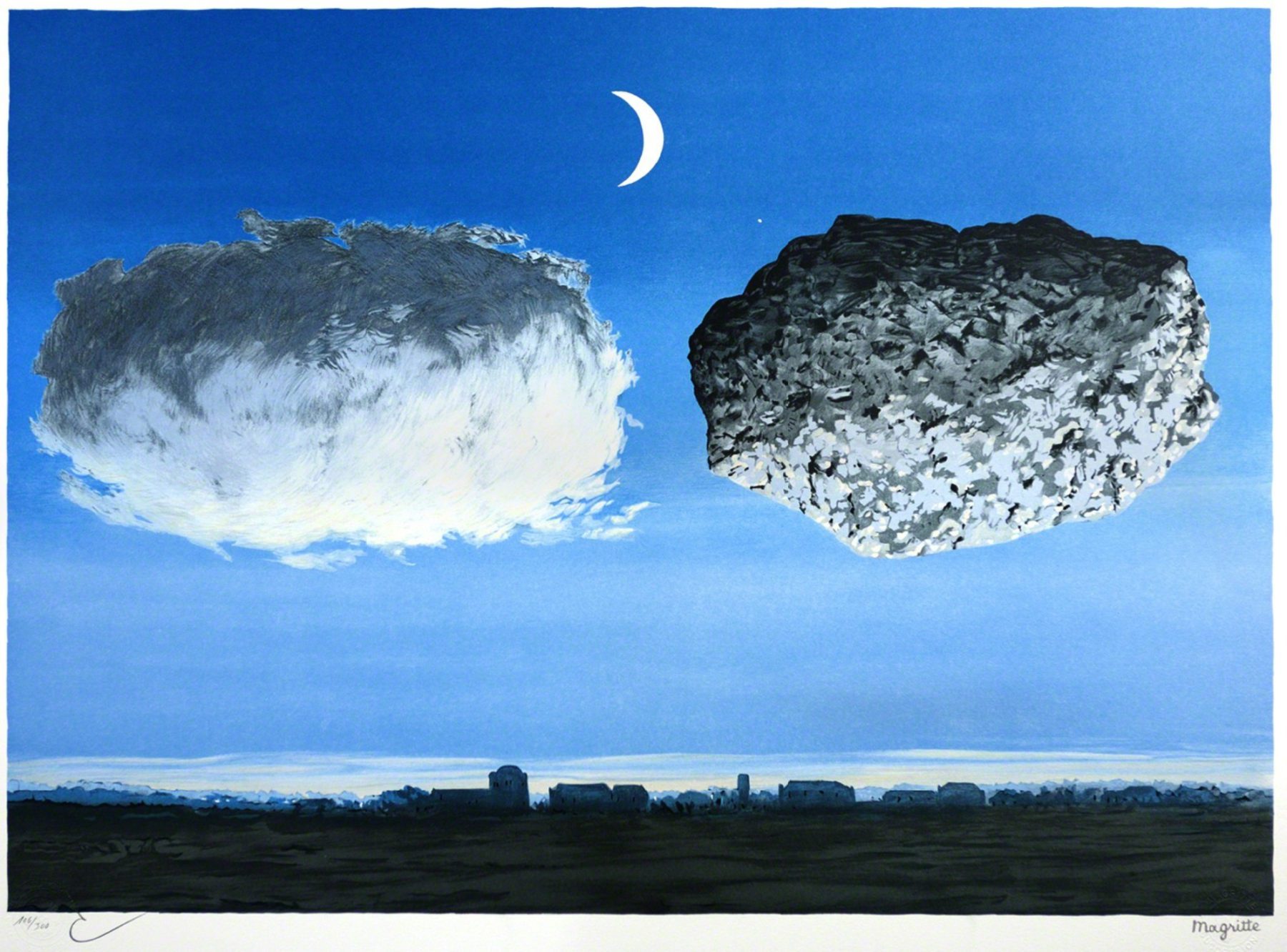
RENE MAGRITTE – La Bataille de l’Argonne (The Battle of the Argonne)
Surrealist artist Rene Magritte does a lovely contrast of textures – the soft cloud vs the rough rock. You can tell the rock is rough via the sharp changes in values and the clouds soft with gradual value changes. He also places the cloud and rock against an untextured background sky to add even more contrast.
Value
Value in art refers to the lightness or darkness of a colour.
WHITE = HIGHEST/LIGHTEST VALUE
BLACK = LOWEST/DARKEST VALUE
Out of all the art elements, value has the most visual weight in creating contrast. Black against white will always create the strongest contrast. You can read more about value here.
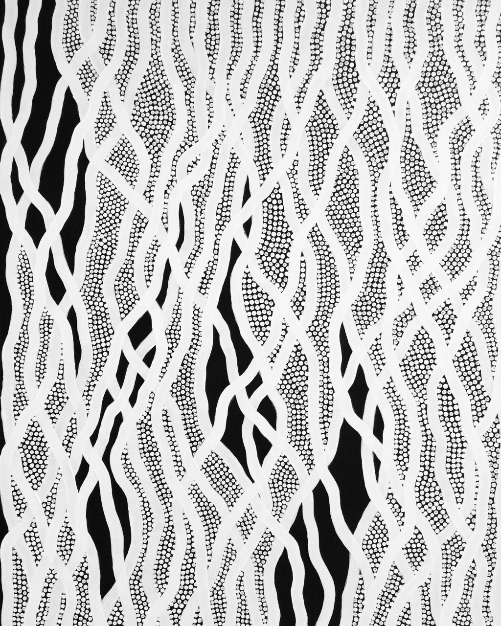
OTIS HOPE CAREY – Ngalunggirr Miinggi
Where the pure black meets the pure white becomes the area of greatest contrast in Otis’s painting. Your eyes are naturally drawn to those focal points.
Contrasting Concepts
Not only can contrast be used in a tactile and visual way it can also be used conceptually by contrasting subject matters. Basic examples include night & day, hot & cold, war & peace. Below is a favourite piece of mine by Australian indigenous artist Vincent Namatjira. In the series, he contrasts Australian leaders, with various voices, power, and influence.
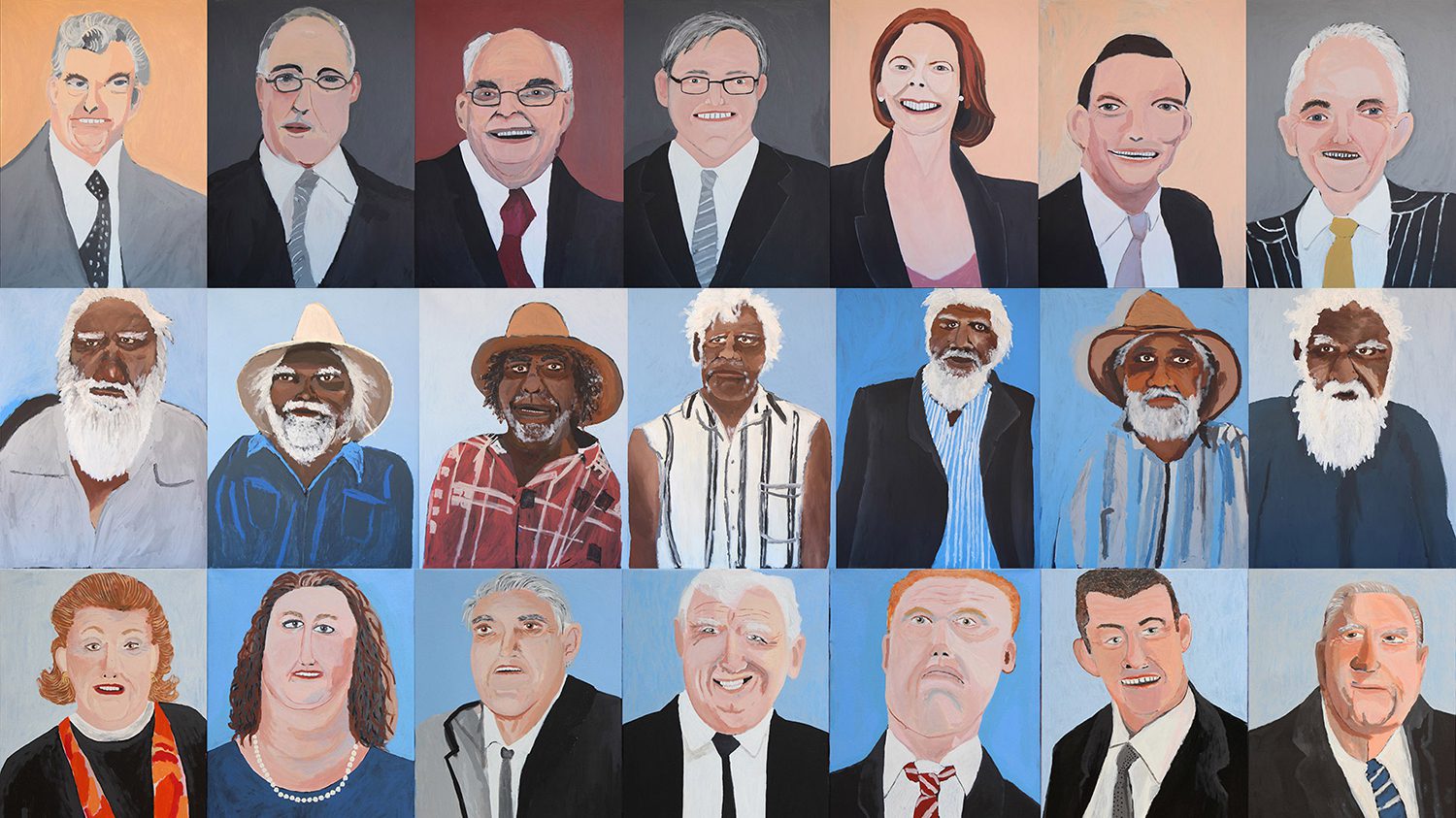
VINCENT NAMATJIRA – Prime Ministers/Seven Leaders/The Richest
“Namatjira’s artworks include three groups of portraits of influential Australians. His first series depicts the seven Prime Ministers who have governed during the artist’s lifetime. The second series features the seven tjilpi (senior law men and leaders) of his community, and the third series is of the seven richest Australians. These portraits highlight issues of wealth, power, and influence in Australian society” (source).
HOMEWORK
Your homework this week is to choose the focal point(s) from the following three artworks and explain why. Below the images, I have included my own interpretation if you get stuck!

Interpretation
1) CLAUDE MONET – Soleil couchant sur la Seine
The orange moon and its reflection become the focal points. Orange’s complementary colour is blue (adjacent colours on the colour wheel) and thus the blue tones help the orange to stand out. The orange moon is also the most saturated colour used and contrasts against the more muted colours.
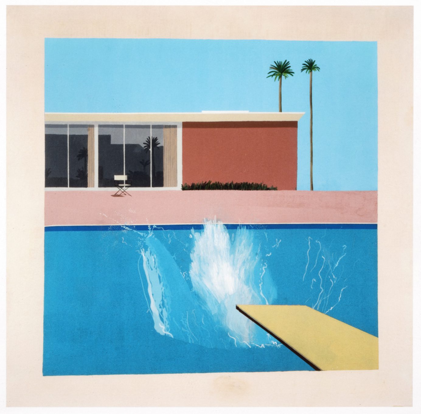
2) DAVID HOCKNEY – A Bigger Splash
The splash becomes the focal point. Its painterly texture contrasts against the smooth block colours of the canvas. Hockney also uses value, the largest amount of pure white occurs within the splash. Worthy of a mention would be the palm trees (their dark value contrasting against the light blue sky) or the white director’s chair against the dark windows.
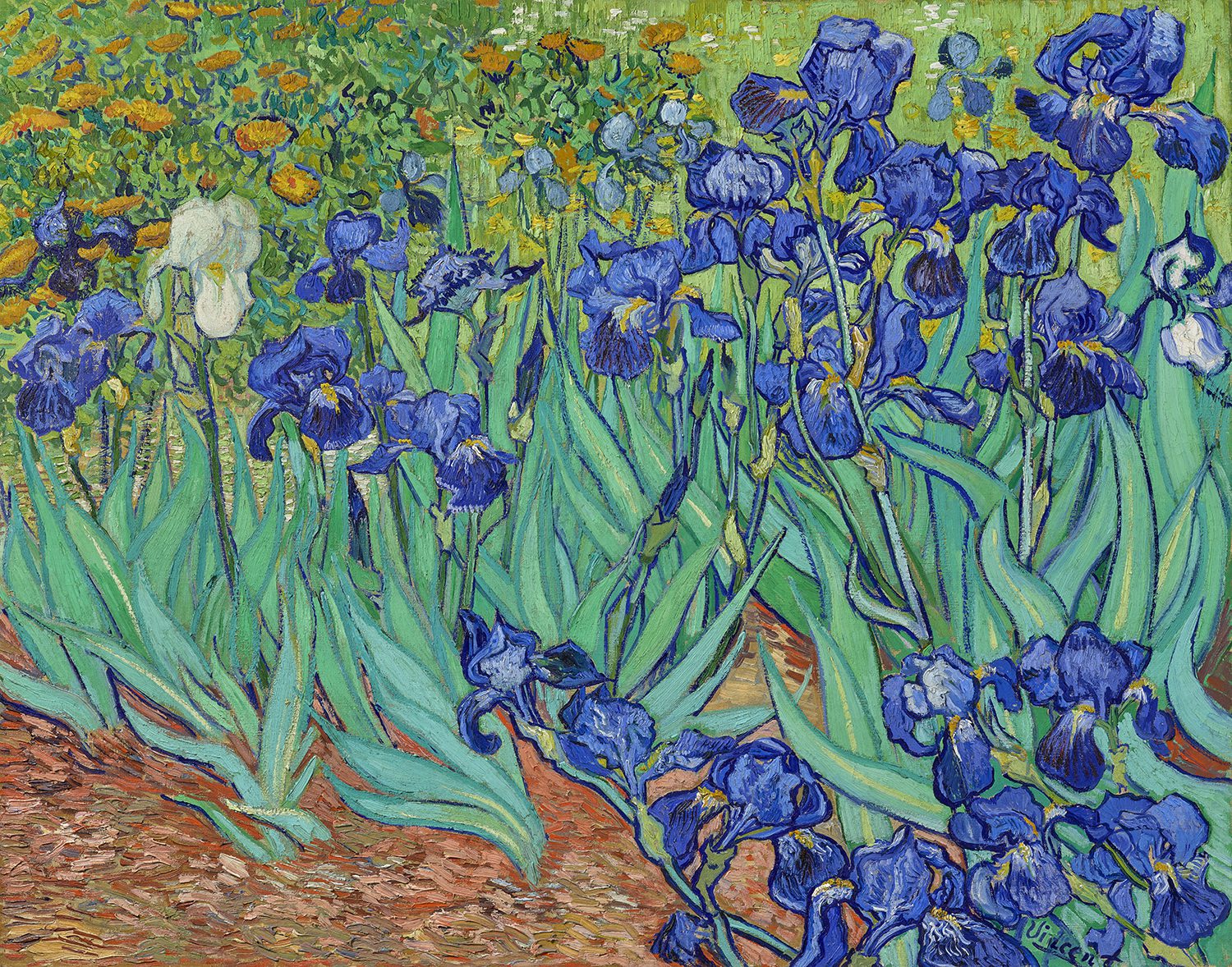
3) VINCENT VAN GOGH – Irises
The white iris draws your attention first. It does so by being the only one and the strongest change in values.
–
Want to see what else I do? Come peek over on my insta or grab a freebie when you sign up to my newsletter below 🙂 🙂