The Secret World of Green; How To Be An Expert At The Colour Wheel
Green is the universally recognised colour for the natural world, evoking a tranquil calming quality. Even the word ‘greenery’ references plants and nature. In most countries with democratic systems, a Green Party exists based on the principles of green politics, such as social justice, environmentalism and nonviolence”. (source)
We see green used heavily in the English language, “green with envy”, “green-eyed monster”, “green thumb”, and more than ever we’re hearing companies that are “going green”. You may be “given the green light” for a project which ties in with the universal traffic light colour for go. Green, represents new growth (the little seed sprouting) and is used as a reference to someone inexperienced or new at a task or role. Western cultures use green to symbolise wealth and money (the US call their paper dollars ‘greenbacks’) whilst if you tell someone they look like they’re “turning green” good chance is that they’re not feeling well. (source)
In Ireland, their national colour is green and universally we associate luck with a four-leaf clover. Green is also linked with colour blindness. Colour blindness usually involves the inability to distinguish between shades of red and green. Deuteranomaly (where green looks redder) is the most common type of red-green colour blindness. (source)
Colour psychology is complex and needs to take into account an individual’s experience of a colour and the culture they experience it. Today I’m going to be taking a deep dive into another (slightly less complex) aspect of colour theory, colour harmony. I’m going to walk you through the RYB (red, yellow, blue) colour wheel model and share a cheat sheet when it comes to using green within your work. A practical post for when you need a little more help with your green palette.
RYB COLOUR WHEEL
Firstly, I need to make sure we’re on the same page with our RYB colour wheel theory. On the wheel, you’ll find three primary colours (red, yellow, blue) which when mixed in pairs, form the secondary colours (orange, green, violet). The remaining six tertiary colours are created when you mix a primary with a secondary colour.
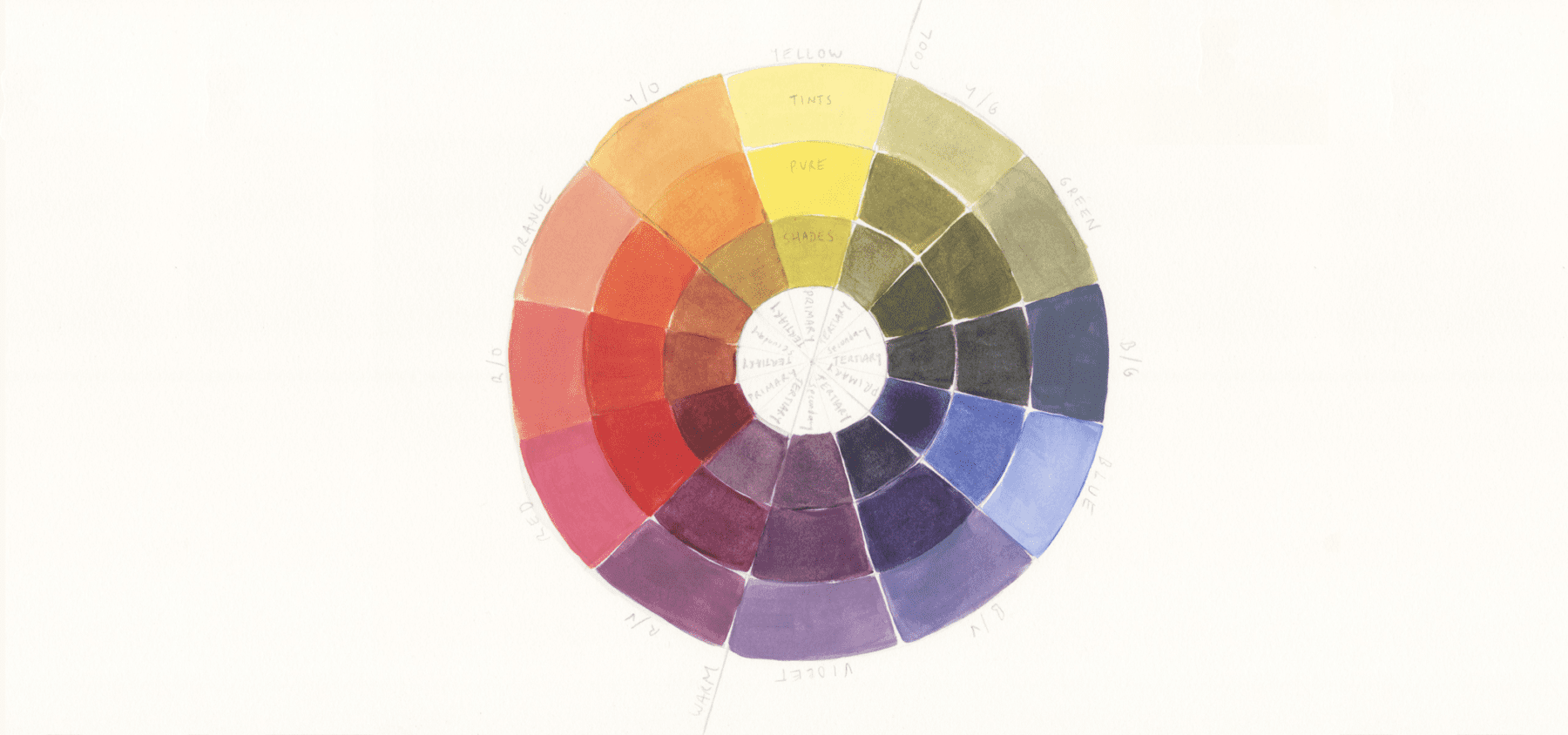
Primary Colours: Red, Yellow, Blue
Secondary Colours:
Orange (red + yellow)
Green (yellow + blue)
Violet (blue + red)
Tertiary Colours:
Red/Violet
Red/Orange
Yellow/Orange
Yellow/Green
Blue/Green
Blue/Violet
You’ll also notice the three rings, the inner rings are the ‘shades’, the middle is the pure colours and the outer ring are the ‘tints’.
Shades (darker) = black paint mixed with the pure colours
Tints (lighter) = white paint mixed with the pure colours
Tints and shades are abundant. Digital colour wheels can provide the full spectrum of colours and are definitely worth utilising.
In the resources list at the bottom there’s a great colour wheel tool for you.
COLOUR HARMONY
Unfortunately, there isn’t one definitive set of rules for colour harmony. Today I’m going to be using the hue templates but it’s important to acknowledge the work of colour theorists such as Wilhelm Ostwald (Color Helm Guide), Albert Munsell (Munsell Color System), and Johanne Itten (Itten’s Color Sphere). Colour theorists have highlighted the importance of saturation (utilising the contrast between pure colours and less saturated tints and shades), using the contrast between warm and cool colours, the proportion of each colour used, and the value of the colour themselves (yellow being the lightest, violet the darkest).
The hue templates below aren’t perfect but they’re a great starting point to discovering what colour combination capture your own attention. I’ve split the hue templates into balanced and contrasting schemes. Feel free to use more than one scheme – you should never feel locked into one template. Most importantly colour is fun, so have fun playing!
The Hue Templates – 7 Colour Schemes
Balanced Schemes
1/ analogous/adjacent
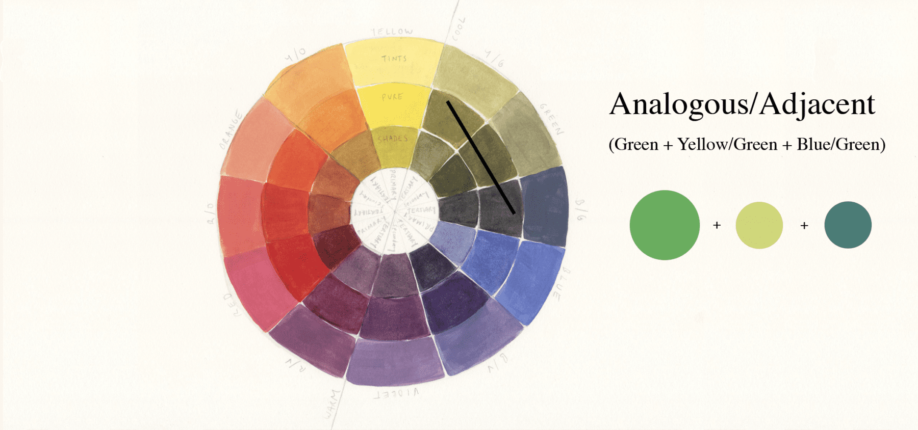
A group of three colours next to each other on the wheel. These colours are the most similar and thus harmonious when placed together.
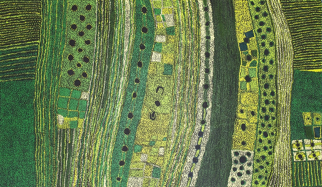
MARINGKA BAKER – Minyma Kutjara Tjukurpa
Maringka’s piece lets the viewer’s eye dart from one adjacent colour to the next.
2/ Monochromatic
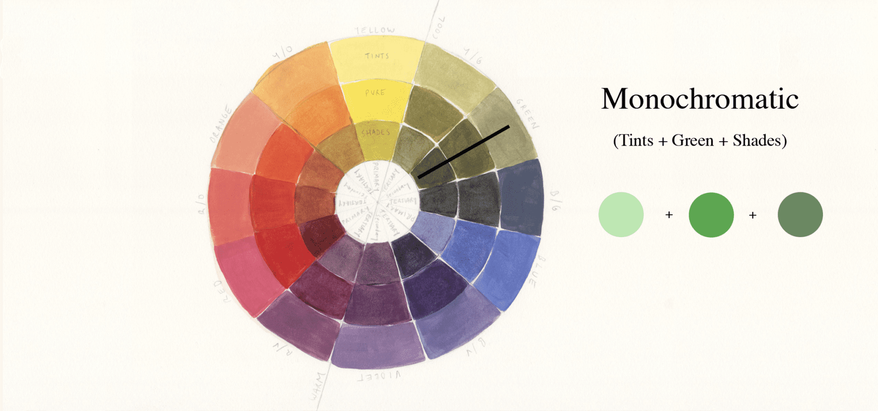
This subtle colour scheme uses one colour in a variety of tints and shades. Remember you achieve a tint by adding white to it and a shade by adding black.
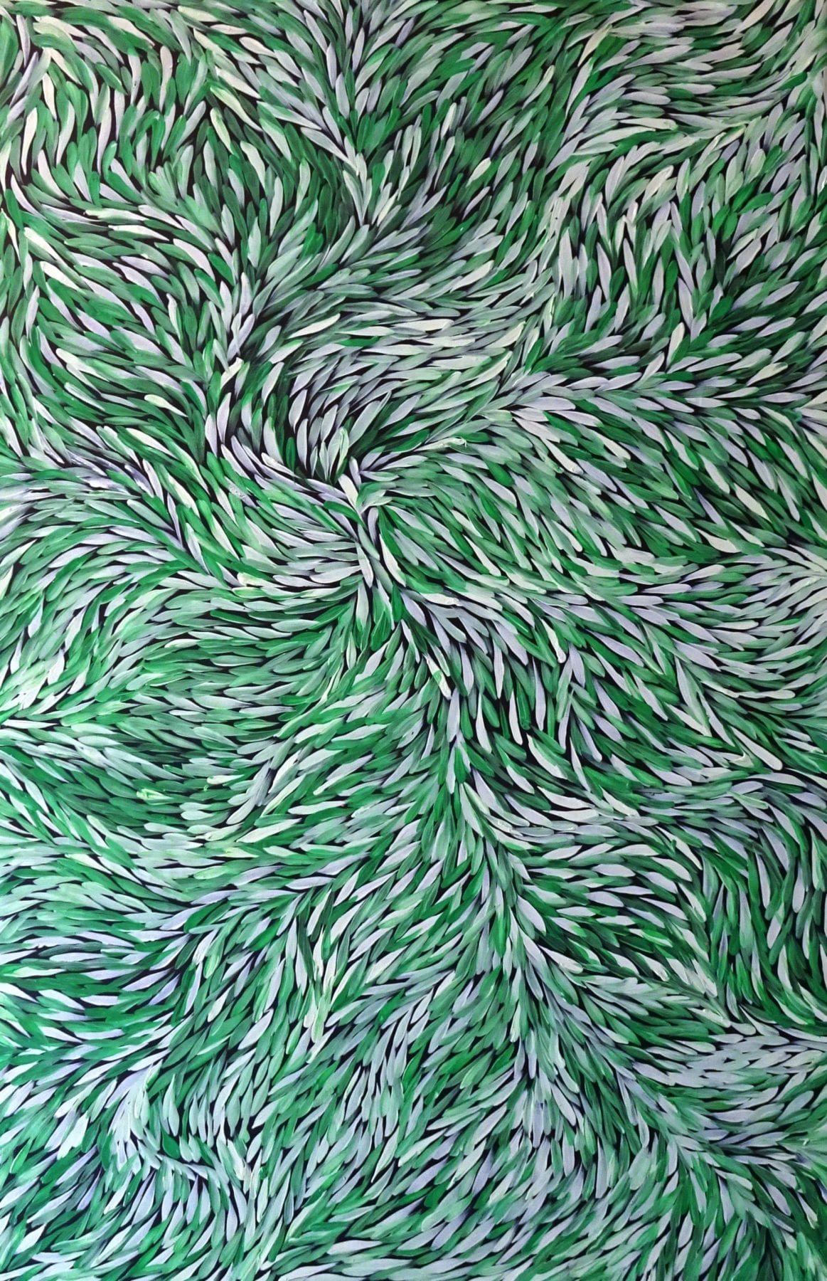
JEANNIE PETYARRE – Bush Leaves
Visual interest is created by adding white into the green for tints and black for shades.
3/ split complementary
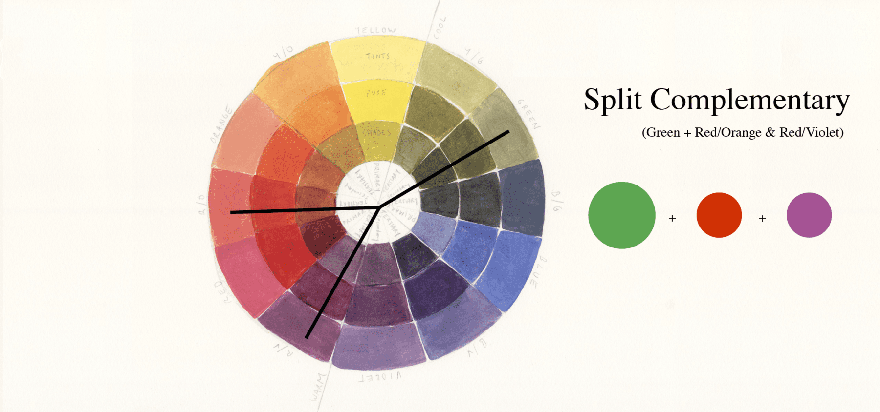
This scheme uses the two colours next to its complementary colour.
Green’s direct complementary colour is red, but in a split complementary, red/orange and red/violet are used.

DAVID HOCKNEY – Gauguin’s Chair
The red/orange and red/violet help to make the vibrant piece slightly less bold and overwhelming.
Contrasting Schemes
4/ Complementary
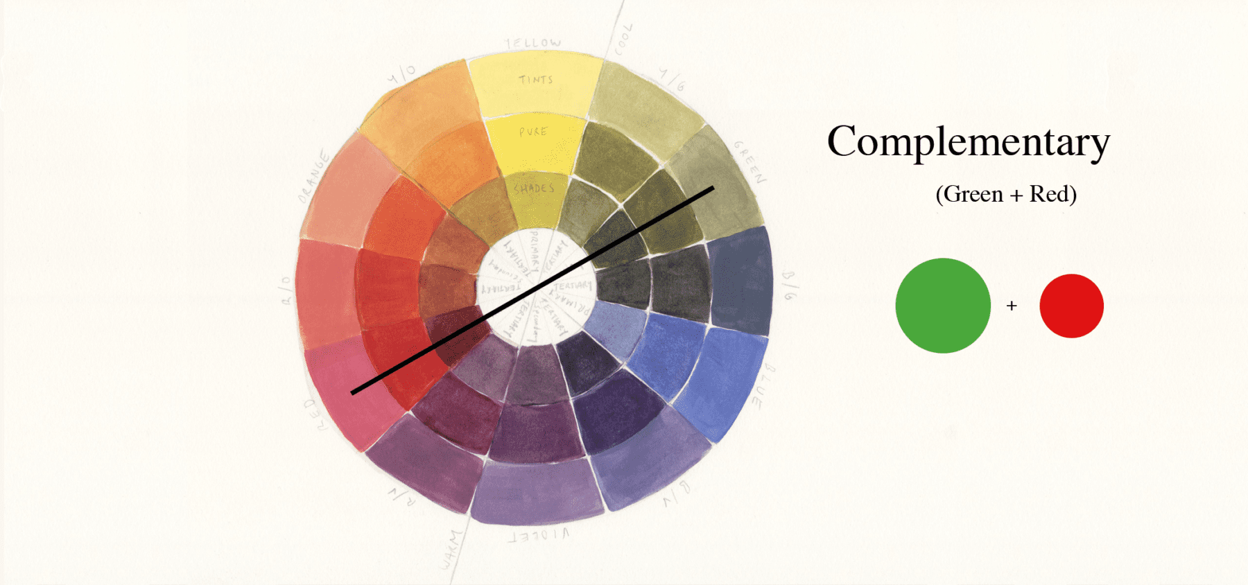
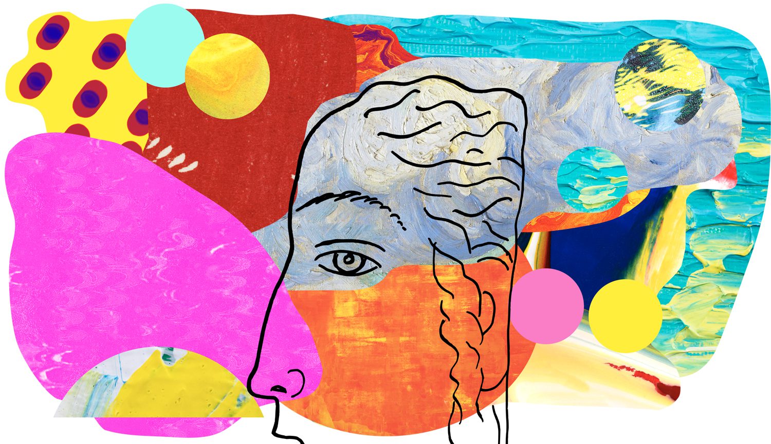
The opposite colours on the colour wheel. For green its complementary colour is red. This pairing creates the most visual tension due to being the most dissimilar, a bold pairing. The word complementary implies that the colours combine to enhance the qualities of the other. French chemist Michel Eugène Chevreul discovered when complementary colours are placed next to each other, they appear more vibrant.
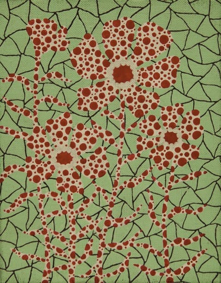
Yayoi uses a tinted green to ease the creative tension between the bold colours.
5/ Triad

Three colours of equal distance on the colour wheel, making for a vibrant and colourful trio where no individual colour dominates the scheme. For green, it’s orange and violet (the other two secondary colours). To avoid an artwork being too bold, you can play around with the amount of each colour used, utilising one colour as the main colour and the other two colours for accents/highlights or using shades and tints of a colour to tone down a piece.

KAREN BARNES – Kangaroo and Joey
Karen plays around with different violet tints to soften the intense pairing of colours.
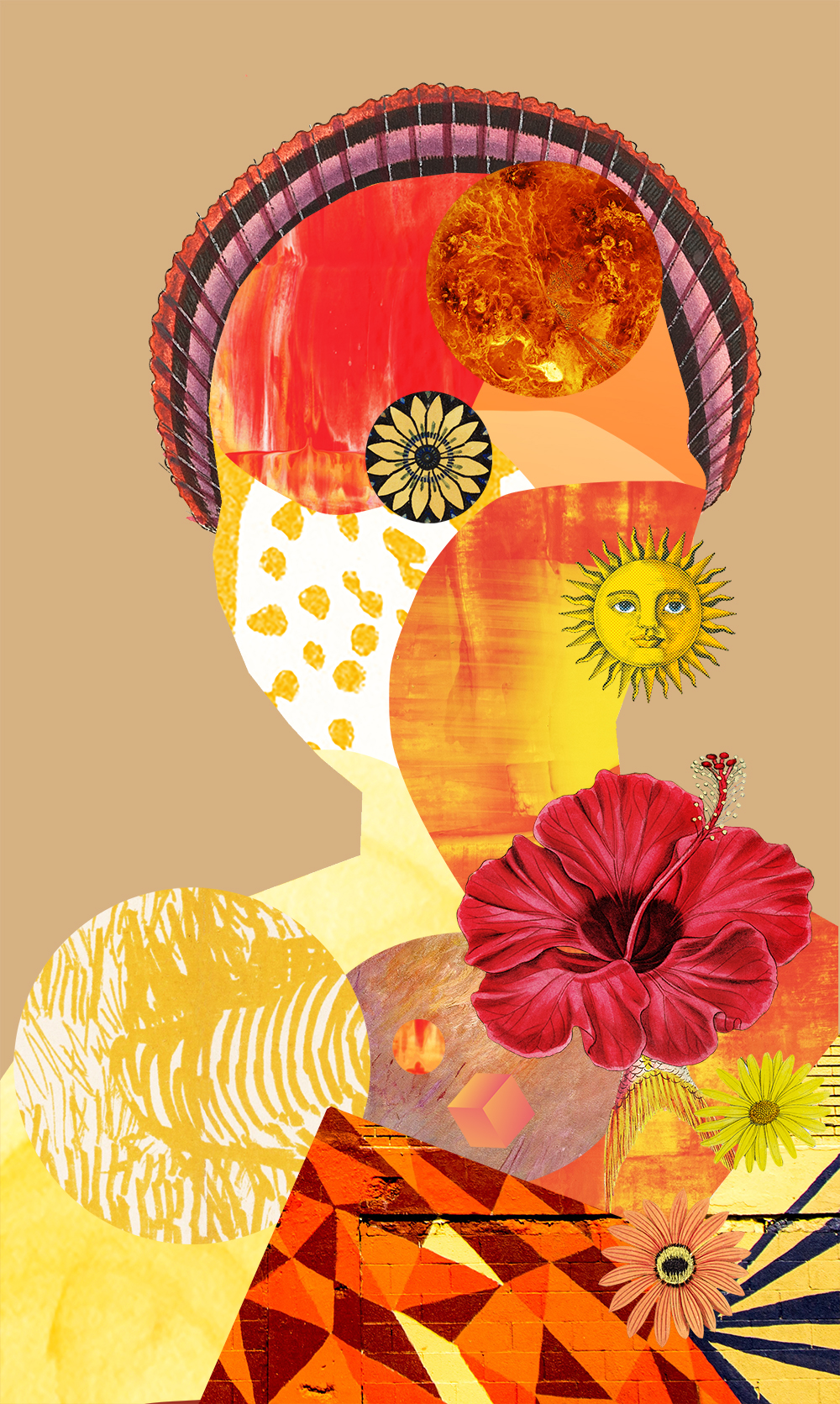
Tetrad or Double Complementary (rectangle or square)
Tetradic means a four-part structure. This scheme comes in a rectangle or square form and is also referred to as a Double Complementary scheme as it’s two pairings of complementary colours.
6/ Tetradic Rectangle
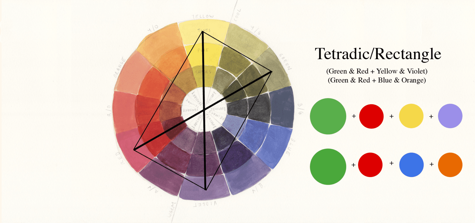
Shaped like a rectangle this scheme uses four colours (2 pairs of complementary colours).
The rectangle can be placed in two different configurations when including the colour green.
green & red + yellow & violet
green & red + blue & orange
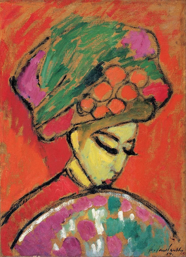
ALEXEJ VON JAWLENSKY – Young Lady In A Flowered Hat
Alexej uses yellow (the lightest hue in the colour wheel) central in the piece to break up the darker colours (violet being the darkest hue) and to draw the viewer in.
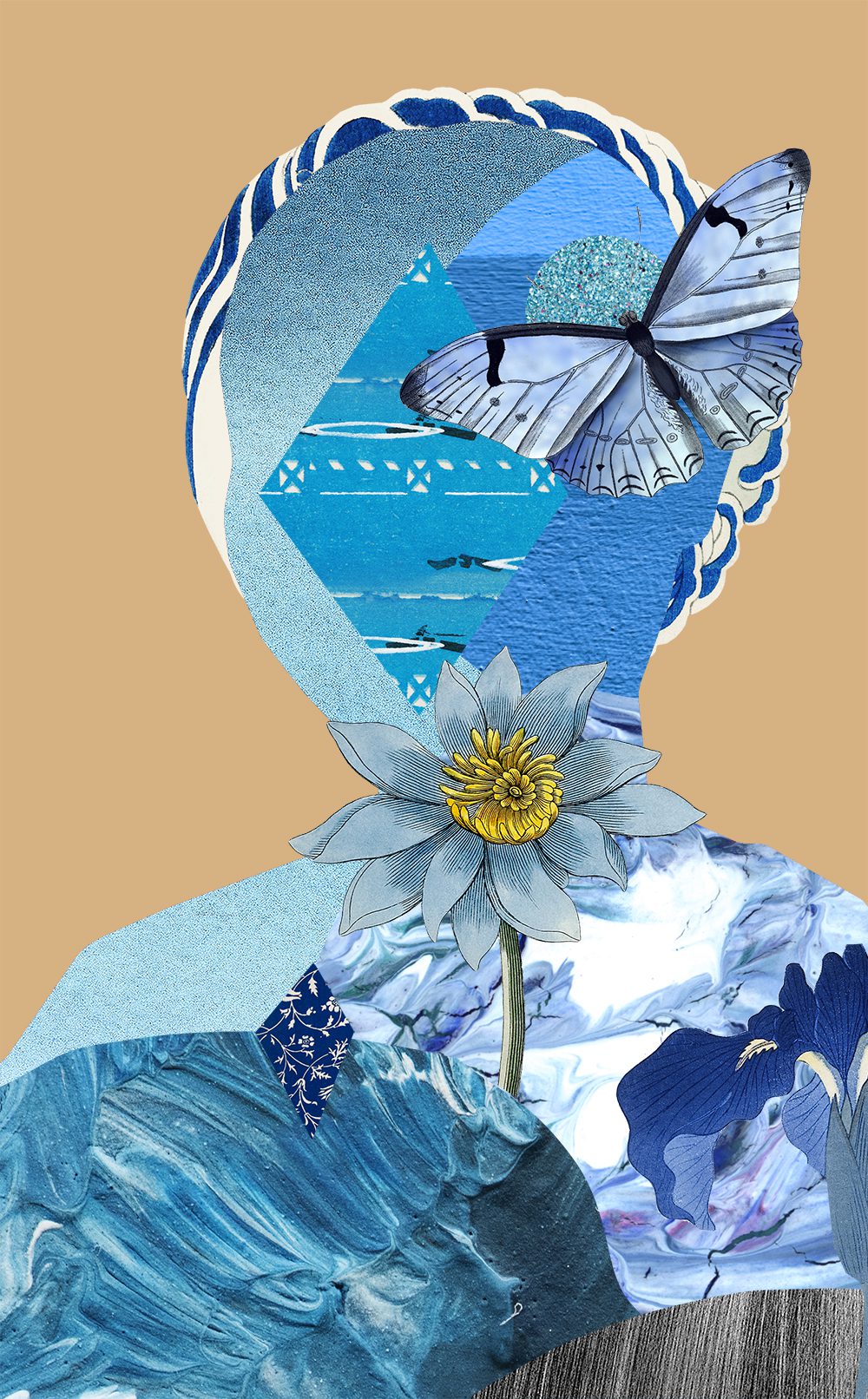
7/ Tetradic Square
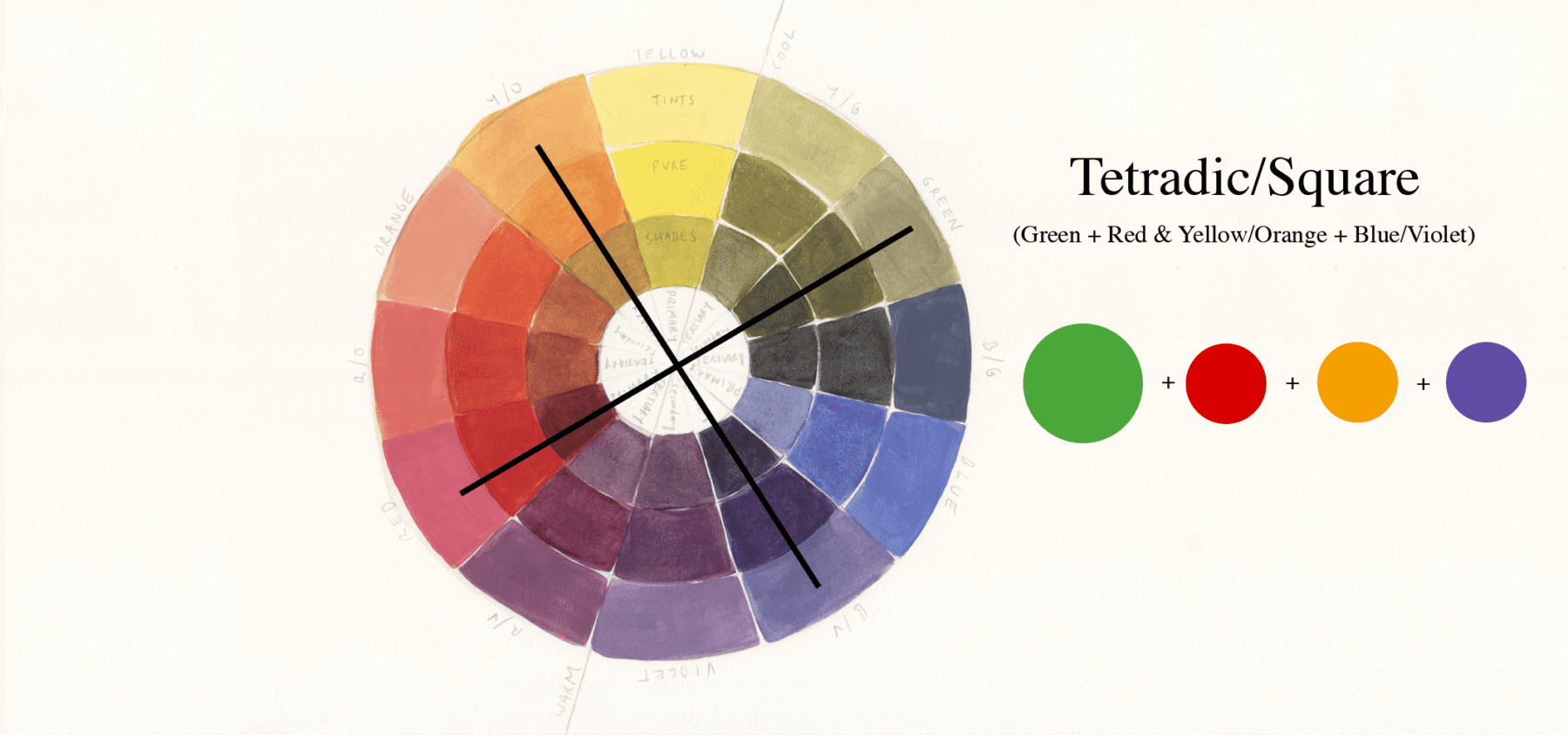
Similar to the rectangle tetradic this time the colours are evenly spaced on the colour wheel and form a mix of contrasting colours.
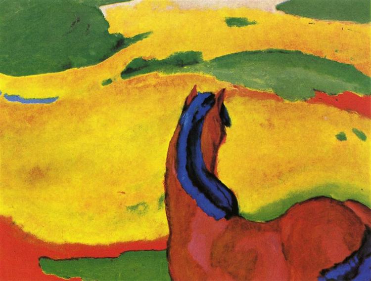
ANDRE DERAIN – Madame Matisse Au Kimono
In this piece the yellow/orange is used as the main colour to break up the other bold and darker colours.
resources
sources used for reference:
–
Want to see what else I do? Come peek over on my insta or grab a freebie when you sign up to my newsletter below 🙂 🙂