The Secret World of Violet; How To Be An Expert At The Colour Wheel
The earliest violet dyes date back to 1900B.C. To extract 1.5grams of dye 12,000 shellfish were needed. Because of the dye’s rarity, it was reserved for emperors and rulers. In a modern context, violet is still associated with nobility, royalty and luxury. Purple (in many western cultures) is a symbolic colour for the gay community whilst the “Purple Heart” is an American award for bravery. In Italy it’s an unlucky omen for performers and audience members to wear purple at an Opera due to its association with mourning and death. Purple is also worn to funerals in Brazil. (source)
Violet emits the smallest wavelength out of all the colours. The smaller the wavelength the more powerful the energy. Since violet is the most powerful colour of the rainbow it’s often linked to fantasy, magic and the supernatural. In the chakra system, the crown chakra is depicted as a violet aura said to connect spirit to the universe. Catholicism uses the colour violet during advent and lent, whilst in Judaism, violet stands for redemption. Violet is often used heavily in Wicca and Pagan religions whilst Buddhism uses the colour for mysticism and Hindus associate it with peace. (source)
Colour psychology is complex and needs to take into account an individual’s experience of a colour and the culture they encounter it in. Today I’m going to be taking a deep dive into another (slightly less complex) aspect of colour theory, colour harmony. I’m going to walk you through the RYB (red, yellow, blue) colour wheel model and share a cheat sheet when it comes to using violet within your work. A practical post for when you need a little more help with your violet palette.
Note: In the colour wheel below, the term violet is used. For this entry, feel free to interchange it with the term purple.
RYB COLOUR WHEEL
Firstly, I need to make sure we’re on the same page with our RYB colour wheel theory. On the wheel, you’ll find three primary colours (red, yellow, blue) which when mixed in pairs, form the secondary colours (orange, green, violet). The remaining six tertiary colours are created when you mix a primary with a secondary colour.
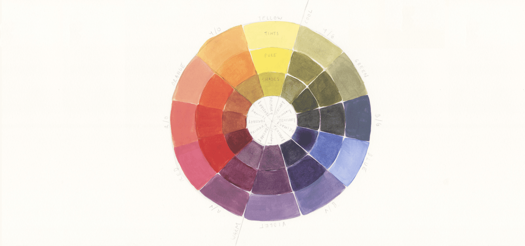
Primary Colours: Red, Yellow, Blue
Secondary Colours:
Orange (red + yellow)
Green (yellow + blue)
Violet (blue + red)
Tertiary Colours:
Red/Violet
Red/Orange
Yellow/Orange
Yellow/Green
Blue/Green
Blue/Violet
You’ll also notice the three rings, the inner rings are the ‘shades’, the middle is the pure colours and the outer ring are the ‘tints’.
Shades (darker) = black paint mixed with the pure colours
Tints (lighter) = white paint mixed with the pure colours
Tints and shades are abundant. Digital colour wheels can provide the full spectrum of colours and are definitely worth utilising.
In the resources list at the bottom there’s a great colour wheel tool for you.
COLOUR HARMONY
Unfortunately, there isn’t one definitive set of rules for colour harmony. Today I’m going to be using the hue templates but it’s important to acknowledge the work of colour theorists such as Wilhelm Ostwald (Color Helm Guide), Albert Munsell (Munsell Color System), and Johanne Itten (Itten’s Color Sphere). Colour theorists have highlighted the importance of saturation (utilising the contrast between pure colours and less saturated tints and shades), using the contrast between warm and cool colours, the proportion of each colour used, and the value of the colour themselves (yellow being the lightest, violet the darkest).
The hue templates below aren’t perfect but they’re a great starting point to discovering what colour combination capture your own attention. I’ve split the hue templates into balanced and contrasting schemes. Feel free to use more than one scheme – you should never feel locked into one template. Most importantly colour is fun, so have fun playing!
The Hue Templates – 7 Colour Schemes
Balanced Schemes
1/ analogous/adjacent

A group of three colours next to each other on the wheel. These colours are the most similar and thus harmonious when placed together.
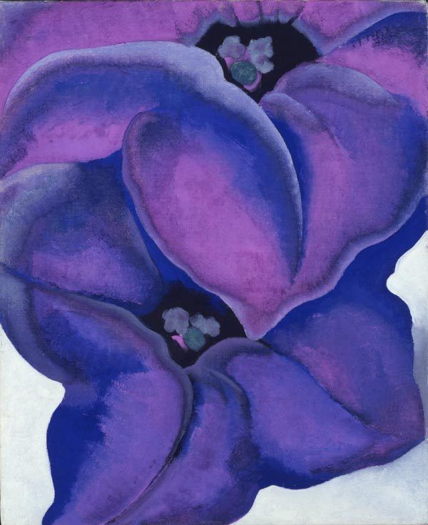
GEORGIA O’KEEFFE – Lilac Petunias
Georgia uses the grouping of colours next to each on the wheel to create harmony yet since violet is a strong colour there’s enough visual interest in the piece.
2/ Monochromatic

This subtle colour scheme uses one colour in a variety of tints and shades. Remember you achieve a tint by adding white to it and a shade by adding black.
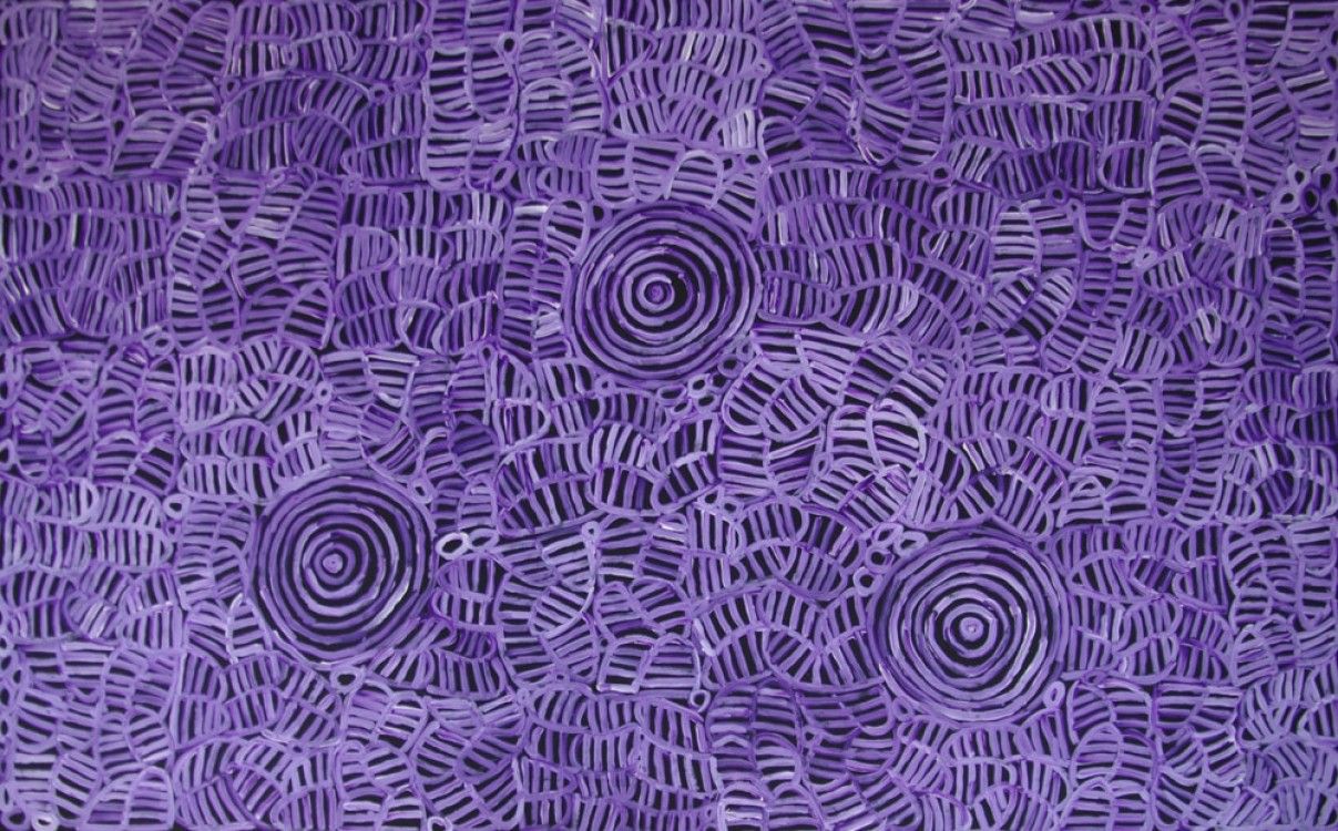
BETTY MBITJANA – Awelye & Bush Melon
Visual interest is created by pairing down the base violet with white and layering the piece upon a black canvas.
3/ split complementary

This scheme uses the two colours next to its complementary colour.
Violet’s direct complementary colour is yellow, but in a split complementary, yellow/orange and yellow/green are used.
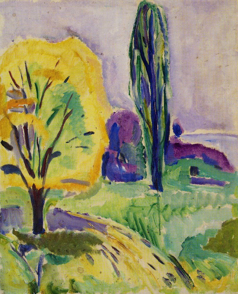
EDVARD MUNCH – Yellow and Green Tree
Edvard plays with tints to soften the piece and incorporates each colour throughout for harmony.
Contrasting Schemes
4/ Complementary
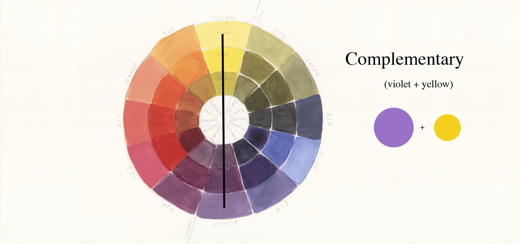
The opposite colours on the colour wheel. For blue its complementary colour is orange. This pairing creates the most visual tension due to being the most dissimilar, a bold pairing. The word complementary implies that the colours combine to enhance the qualities of the other. French chemist Michel Eugène Chevreul discovered when complementary colours are placed next to each other, they appear more vibrant.
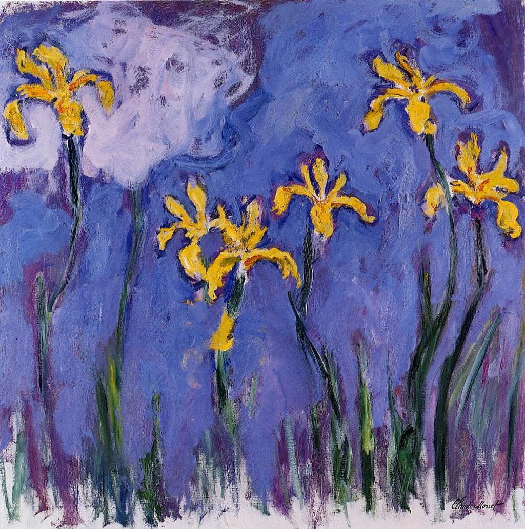
CLAUDE MONET – Yellow Irises with Pink Cloud
This piece shows the use of one dominant colour (violet) with yellow used as an accent colour.
5/ Triad
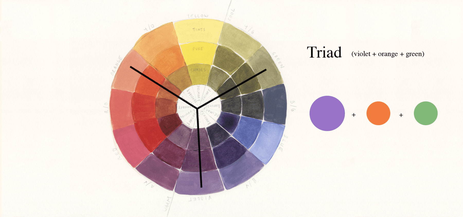
Three colours of equal distance on the colour wheel, making for a vibrant and colourful trio where no individual colour dominates the scheme. For violet, it’s orange and green (the other two secondary colours). To avoid an artwork being too bold, you can play around with the amount of each colour used, utilising one colour as the main colour and the other two colours for accents/highlights or using shades and tints of a colour to tone down a piece.

KAREN BARNES – Kangaroo and Joey
Karen plays around with different violet tones to soften the intense pairing of colours.
Tetrad or Double Complementary (rectangle or square)
Tetradic means a four-part structure. This scheme comes in a rectangle or square form and is also referred to as a Double Complementary scheme as it’s two pairings of complementary colours.
6/ Tetradic Rectangle

Shaped like a rectangle this scheme uses four colours (2 pairs of complementary colours).
The rectangle can be placed in two different configurations when including the colour violet.
violet + yellow & red + green
violet + yellow & blue + orange

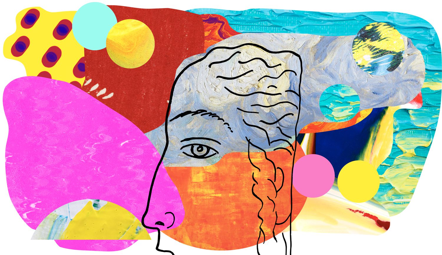
Matisse uses the complimentary pairing of yellow and purple to dominate and small accent of green in the waist band and red in the lip and hair piece.
7/ Tetradic Square
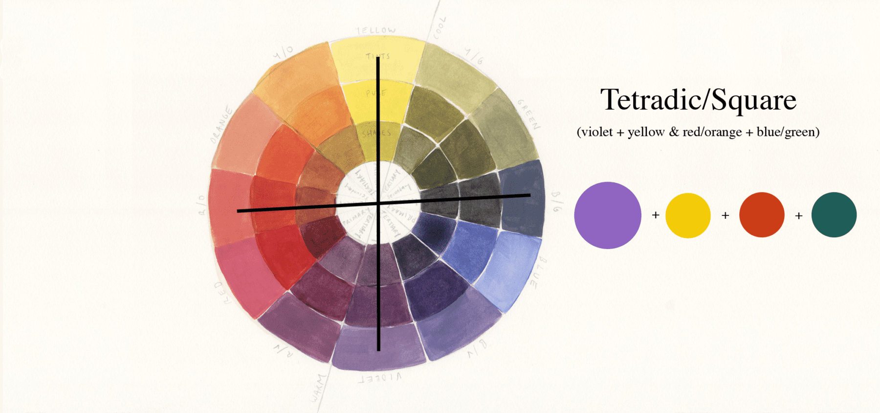
Similar to the rectangle tetradic this time the colours are evenly spaced on the colour wheel and form a mix of contrasting colours.
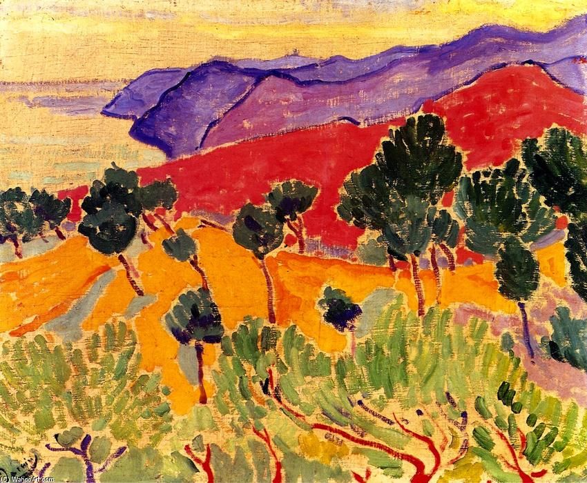
ANDRE DERAIN – Landscape by the Sea: The Côte d’Azur near Agay
By using different tones of yellow and green and violet Andre tones down the piece. He also uses the lighter colours to dominate.
resources
sources used for reference:
–
Want to see what else I do? Come peek over on my insta or grab a freebie when you sign up to my newsletter below 🙂 🙂