THE SECRET WORLD OF YELLOW; HOW TO BE AN EXPERT AT THE COLOUR WHEEL
Today we’re taking a deep dive into the primary colour yellow, the lightest hue on the spectrum and thus the brightest and most visible. A human’s peripheral vision is 2.5 times higher for yellow than for red. Yellow is an attention-seeking colour, commonly used for warning signs, seen on taxis and let’s not forget those iconic golden arches for Macdonalds. In nature, we have the warmth from the golden sun whilst fields of daffodils and sunflowers denote cheerful optimism and joy. The colour yellow is also synonymous with the happy face. Colour association needs to take into account, personal experience of a colour and the culture an individual experiences it in. In Japan, yellow represents bravery, in China, a ‘yellow movie’ means an adult movie, yet in ancient Chinese culture, yellow was a symbol of power and nobility. In Russia, a ‘yellow house’ was once known as an insane asylum and yellow stars of David were forcefully worn by Jews during the nazi occupation (source).
It’s true that we all experience the sun and its golden yellow light but we have different associations with yellow dependant on our experience and background. These restraints makes colour psychology complex, so I’m focusing in on another aspect of colour theory, colour harmony. I’m going to walk you through the RYB (red, yellow, blue) colour wheel model and share a cheat sheet when it comes to using yellow within your work. A practical post for when you need a little more help with your yellow palette.
RYB COLOUR WHEEL
Firstly, I need to make sure we’re on the same page with our RYB colour wheel theory. On the wheel, you’ll find three primary colours (red, yellow, blue) which when mixed in pairs, form the secondary colours (orange, green, violet). The remaining six tertiary colours are created when you mix a primary with a secondary colour.
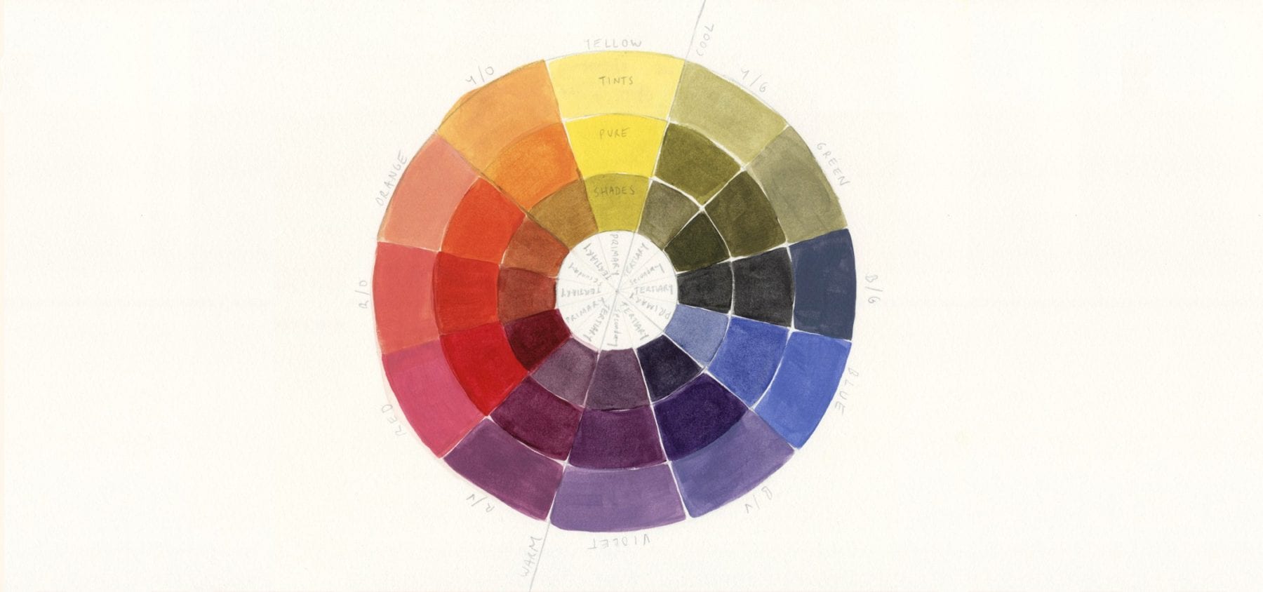
Primary Colours: Red, Yellow, Blue
Secondary Colours:
Orange (red + yellow)
Green (yellow + blue)
Violet (blue + red)
Tertiary Colours:
Red/Violet
Red/Orange
Yellow/Orange
Yellow/Green
Blue/Green
Blue/Violet
You’ll also notice the three rings, the inner rings are the ‘shades’, the middle is the pure colours and the outer ring are the ‘tints’.
Shades (darker) = black paint mixed with the pure colours
Tints (lighter) = white paint mixed with the pure colours
Tints and shades are abundant. Digital colour wheels can provide the full spectrum of colours and are definitely worth utilising.
In the resources list at the bottom there’s a great colour wheel tool for you.
COLOUR HARMONY
Unfortunately, there isn’t one definitive set of rules for colour harmony. Today I’m going to be using the hue templates but it’s important to acknowledge the work of colour theorists such as Wilhelm Ostwald (Color Helm Guide), Albert Munsell (Munsell Color System), and Johanne Itten (Itten’s Color Sphere). Colour theorists have highlighted the importance of saturation (utilising the contrast between pure colours and less saturated tints and shades), using the contrast between warm and cool colours, the proportion of each colour used, and the value of the colour themselves (yellow being the lightest, violet the darkest).
The hue templates below aren’t perfect but they’re a great starting point to discovering what colour combination capture your own attention 🙂 I’ve split the hue templates into balanced and contrasting schemes. Feel free to use more than one scheme – you should never feel locked into one template. Most importantly colour is fun, so have fun playing!
The Hue Templates – 7 Colour Schemes
Balanced Schemes
1/ analogous/adjacent

A group of three colours next to each other on the wheel. These colours are the most similar and thus harmonious when placed together.
I’ve selected the two colours next to yellow in order to utilise colours from the warm half of the colour wheel for further harmony.
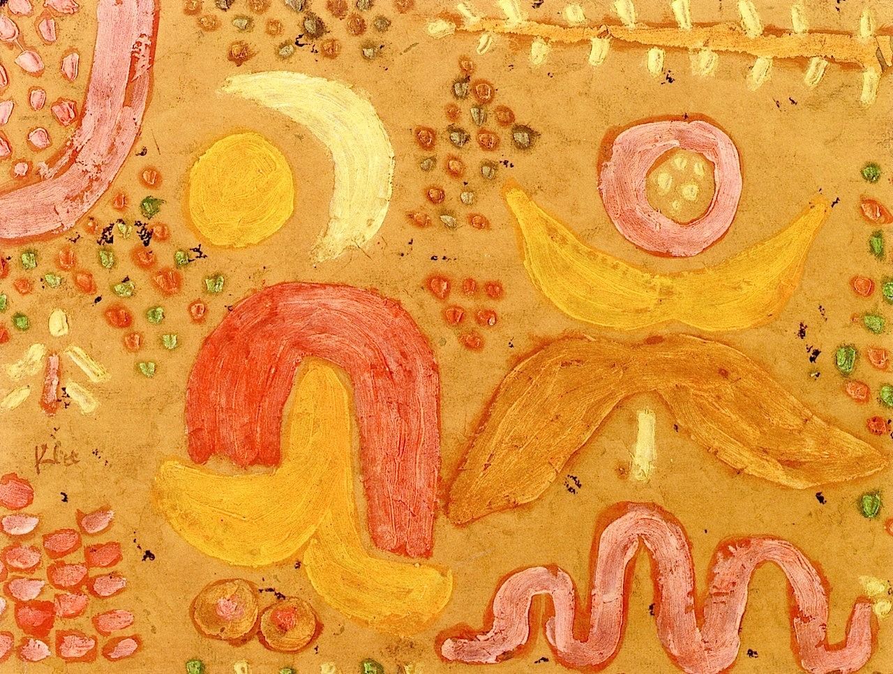
PAUL KLEE – The Garden in Hot Weather
This piece by Paul Klee shows the concept of sticking to a narrow colour palette and the possibilities of yellow when paired with close warm neighbours, creating a rich and warm painting.
2/ Monochromatic

This subtle colour scheme uses one colour in a variety of tints and shades. Remember you achieve a tint by adding white to it and a shade by adding black. The tints and shades of yellow help to tone down the vibrancy of this primary colour.
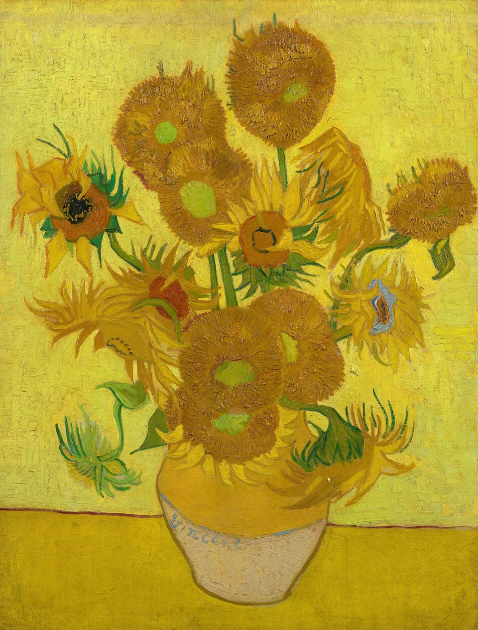
A monochromatic scheme can sometimes lack visual interest. In the above painting, you can see Vincent has added in green and touches of blues 🙂
Vincent was in love with the vibrant chroma yellow hues, developed during the 19th century. In his sunflower series, we spy lighter yellows achieved through adding white (tints) and mixing yellow with black for darker tones (shades). On a random side note, a chemical reaction is causing his sunflower series to fade to brown (especially the yellows Vincent mixed with white). Restorers are trying to mitigate future damage by controlling the painting’s exposure to heat.
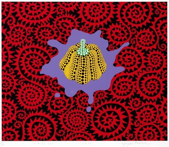
3/ split complementary

This scheme uses the two colours next to its complementary colour and can often be a softer choice over the direct complementary scheme. Yellow’s direct complementary colour is violet, but in a split complementary, red/violet and blue/violet are used. If using a split complementary palette trying using yellow as the main colour and then red/violet and blue/violet as the highlights/accents. Or you could try the opposite and have red/violet and blue/violet as the dominant colours and yellow as a highlight or accent.
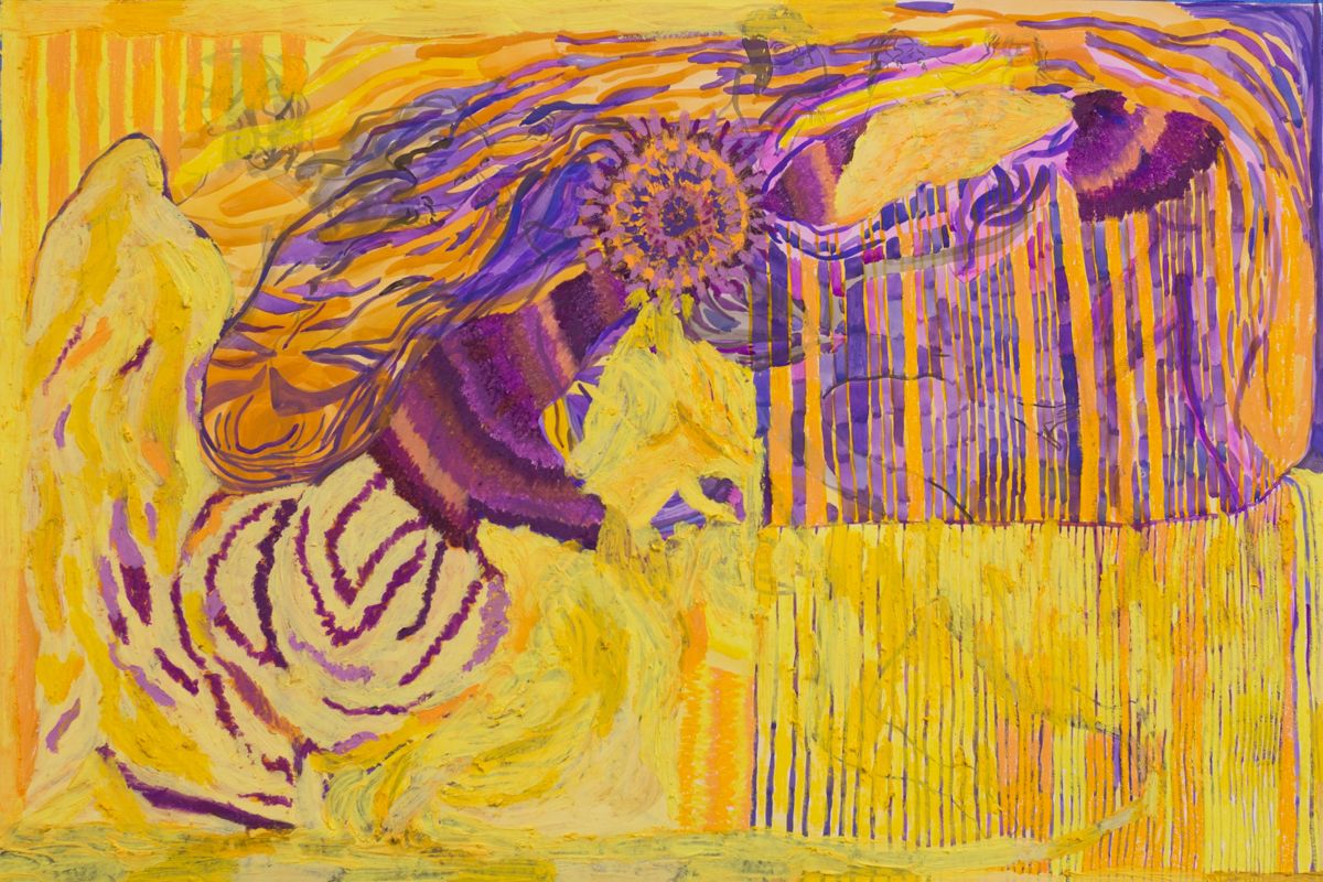
MARIA KOROL – Study in Yellow and Violet (401)
Although there are some oranges thrown in, Maria is able to utilise the split complementary scheme with yellow as the dominant colour.
Contrasting Schemes
4/ Complementary

The opposite colours on the colour wheel. For yellow its complementary colour is violet. This pairing creates the most visual tension due to being the most dissimilar, a bold pairing. The word complementary implies that the colours combine to enhance the qualities of the other. French chemist Michel Eugène Chevreul discovered when complementary colours are placed next to each other, they appear more vibrant.
Mitjili Napurrula shows us that this strong pairing of colours can work together in harmony, placed side by side the colours help to create vibrancy.
5/ Triad
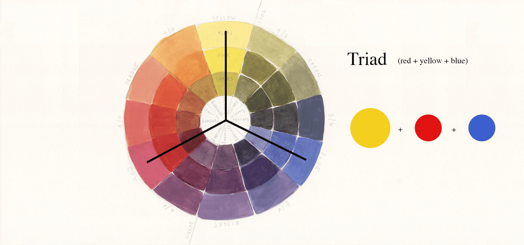
Three colours of equal distance on the colour wheel, making for a vibrant and colourful trio where no individual colour dominates the scheme. For red, its yellow and blue (the other two primary colours). A tip is to play around with different tints and shades of each colour as the danger of this scheme is colour overload.
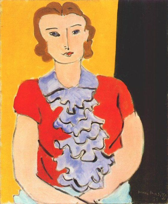
HENRI MATISSE – The Blue Jabot
This painting shows how playing around with the lightness of the blue helps tone down the boldness.
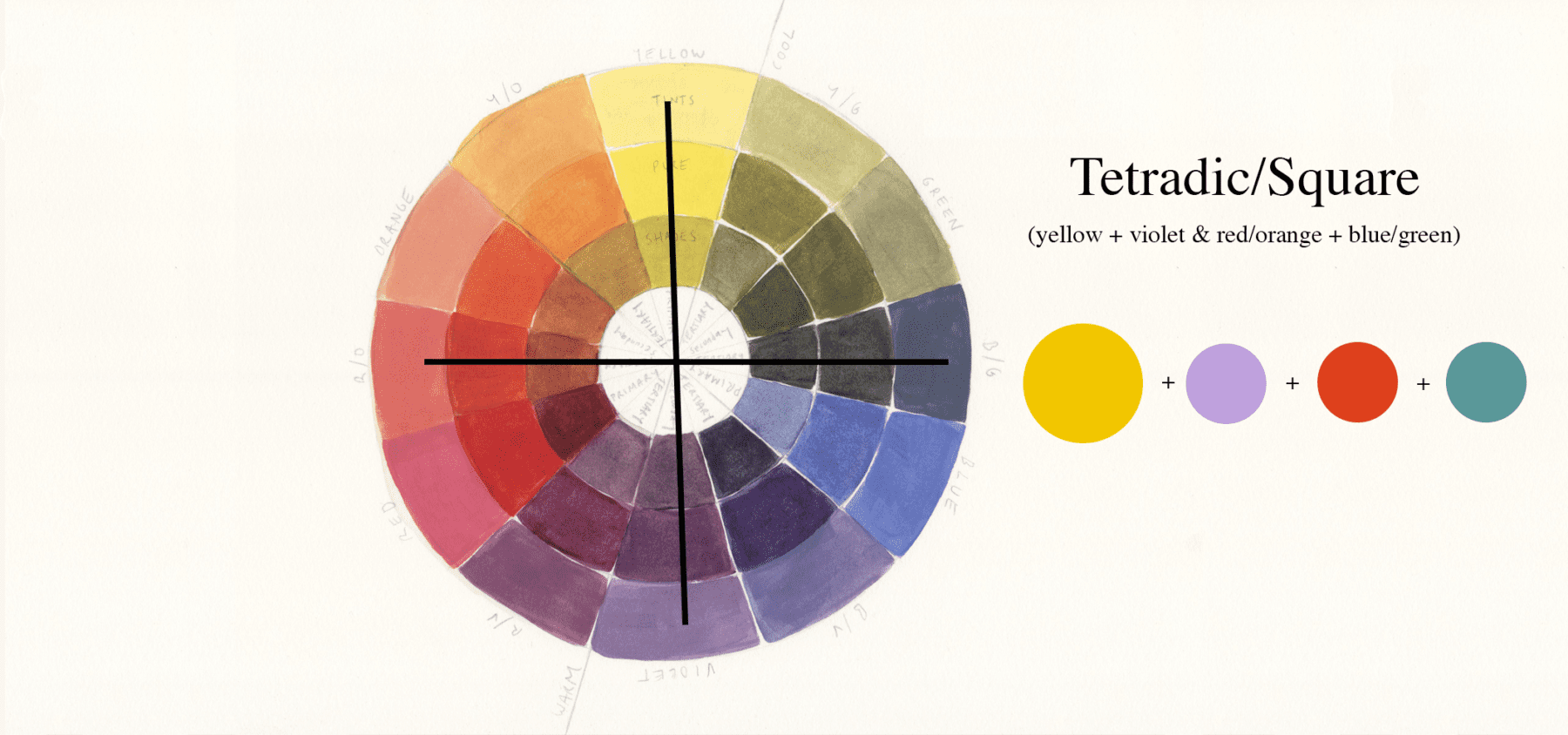
Tetrad or Double Complementary (rectangle or square)
Tetradic means a four-part structure. This scheme comes in a rectangle or square form and is also referred to as a Double Complementary scheme as it’s two pairings of complementary colours.
6/ Tetradic Rectangle

Shaped like a rectangle this scheme uses four colours (2 pairs of complementary colours). Ideally, one colour should dominate the scheme in this vibrant grouping.
The rectangle can be placed in two different configurations when including the colour yellow.
yellow + violet & red + green
yellow + violet & orange + blue

HENRI MATISSE – Odalisque In Red Jacket
Here you can see Matisse uses red to dominate the tetradic rectangle scheme with yellow, purple, and green used to complement.
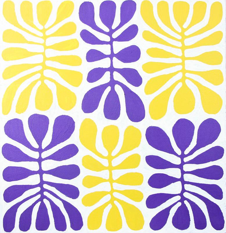
7/ Tetradic Square
Similar to the rectangle tetradic this time the colours are evenly spaced upon the colour wheel and form a mix of contrasting colours.
A lovely use of the tetradic square using red as the dominant colour.
resources
sources used for reference:
–
Want to see what else I do? Come peek over on my insta or grab a freebie when you sign up to my newsletter below 🙂 🙂